In the introduction to our dataviz workshop at a Fortune 50, the Chief Operating Officer told the room of his employees that he was looking forward to seeing their work improve as a result of what they learned with us. Because, he said, what they wanted to see on the…
Uncategorized
Shaky Data Viz Advice
The biggest a-ha moment that came from my dissertation was discovering what shaky ground we stand on in data visualization. When my friends heard I was going to study data visualization, they filled my desk with books from Edward Tufte, Stephen Few, and even Garr Reynolds. I was thirsty for…
How to Not Host a “Manel”
After a dust up on Twitter that I’ll explain below, I got so many white dudes in my DMs who wanted me to personally educate them on how to host a more inclusive set of keynotes and panelists at their conference. So I’m writing this post, without compensation, this one…
Asked and Answered: Visualizing Demographic Data
This blog post is part of a series called Asked and Answered, about writing great survey questions and visualizing the results with high impact graphs. Dr. Sheila B. Robinson is authoring the Asked series, on writing great questions. Dr. Stephanie Evergreen is authoring the Answered series, on data visualization.
Announcing The Evergreen Data Certification Program
Have you ever signed up for an online course with really good intentions, only to find yourself barely checking in a couple months later? In The Evergreen Data Certification Program, we will not let you fade away. When you commit to The Evergreen Data Certification Program, you earn a…
2020 Evergreen Mentoring Program
This past year, I wrote an article that required all the vulnerability and bravery I had that whole month. It was about being a woman in data visualization and some (just some) of the shit that has come with it. It was exhausting to recall the experiences I discussed…
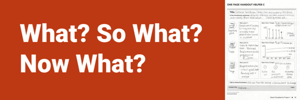
What? So What? Now What?
People who are short on time (i.e., most everyone) have these three questions on their mind, in this order. What’s going on? What does this mean to me? What are we (actually, YOU) going to do about it? The shorthand way of structuring that storyline: What, So What, Now…
Calling the Data Viz Curious
Ever spot those gorgeous graphs in the New York Times or the Washington Post and wish you could make them? You can. And you don’t need fancy software to do it. Good graphs, at their core, are based on a few fundamental principles of data visualization design, a structured…
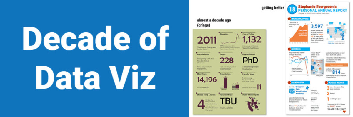
Decade of Data Viz
Well, that just flew by. Ten years ago, I was in the throes of writing my dissertation on Presenting Data Effectively, knowing I had focused on a topic that the world was hungry for, even if they didn’t know it yet. I had collected enough literature and data to know…
Four Ways to Show Projections
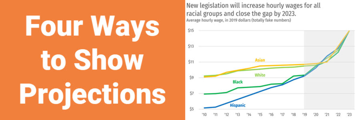
Of course we all want to know what will happen in the future. These days folks are looking at data like it has a crystal ball. To the extent that we provide our audiences with projected data, let’s talk about ways to visualize the projected data. Because here’s the thing:…
