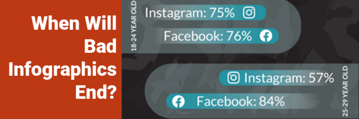
Back in November of **2010** I set up a Google Alert for “infographic.” Oh, I thought, these are an interesting development in how we communicate data. But either the quality of the design will drastically improve or these things will be a fad that disappears within a couple years.
Uncategorized
Excel vs. Tableau vs. R
We are hard core believers that you should become the master of the tools you own. If your company relies on Microsoft, figure out how to use Excel to make amazing data visualizations. If your company invested in a site-wide license for Tableau, climb over that learning curve and master…
Audience Engagement Strategies
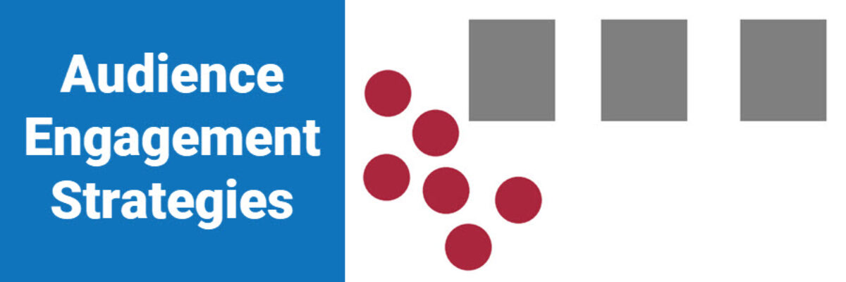
Dr. Sheila Robinson is a master at engaging an audience. She’s honed this skill through decades of work in education where you have to know how to take the pulse of a room and determine whether a change in direction is needed to keep the group tuned in. You…
The Dashboard Sketch Process
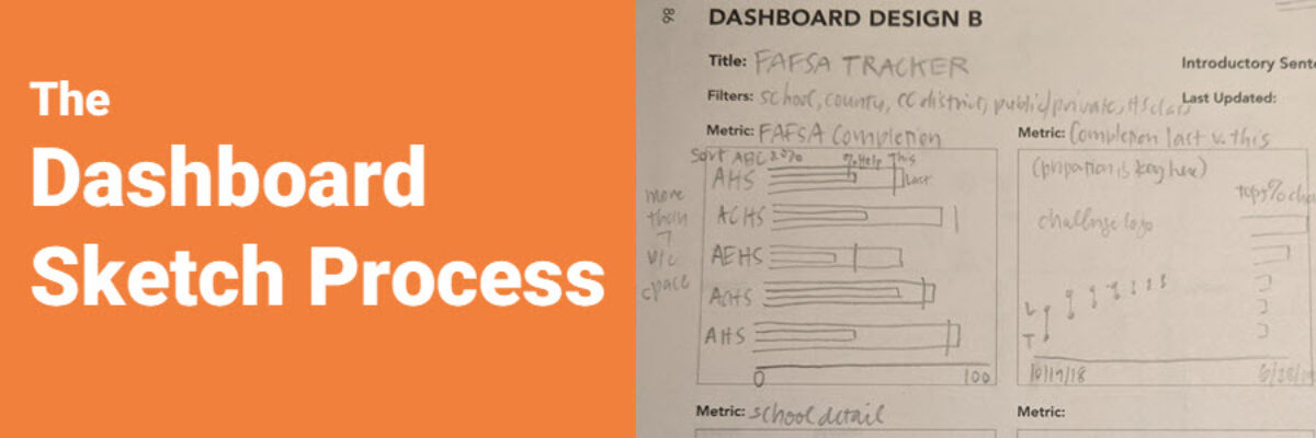
“I vote no.” This short answer speeds up the dashboard development process significantly. And I developed the question my client voted on in roughly 3 minutes, by showing her a quick sketch of some possible graph options. My client is in charge of a dashboard that tracks how high school…
Everyone’s Opinions About Your Dashboard
The primary struggle with dashboard development is not identifying the right key performance indicators, building the graphs in your favorite software, or even getting people excited about the idea of using a dashboard. That’s all a cake walk compared to managing people and their reactions to the dashboard. Let…
Data Fortune Tellers
Pick a color, any color. You know how this game goes. You pick a color, your friend opens and closes the fortune teller, spelling out the name of the color you selected. You pick a number from the visible choices, your friend opens and closes the fortune teller, until you…
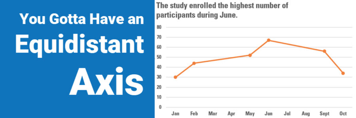
You Gotta Have An Equidistant Axis
Here’s the thing: The scale used on each axis must have equal intervals. It’s an easy mistake to make. Excel automatically spaces your intervals and labels equidistant from one another but it is assuming that your intervals actually are equidistant. In this graph, that’s not the case. We are missing…
Announcing The Chart Starter Series
So, hey, heads up: The Chart Starter Series is probably not for you. If you know my work well, you are probably already a dataviz whiz. The Chart Starter Series is for your colleague. You know the one. The one who keeps asking you to make their graphs. Tell…
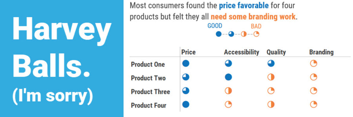
Harvey Balls
I’m guessing that 90% of the people who search on “Harvey Balls” and end up on this blog post are not here for the same reason I’m here. I’m here to talk to you about qualitative data. And this one can be a little NSFW. Harvey Balls are an…
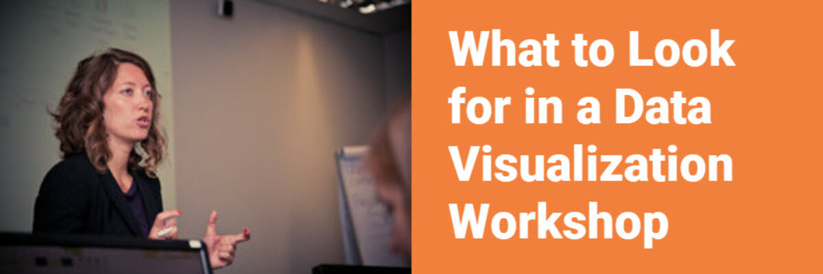
What to Look for in a Data Visualization Workshop
Data visualization workshops are an investment into your growth as a leader in your field. They should, if they are good, produce immediate returns on your investment which should show up as significantly increased use of your work, attention from existing and potential customers and partners, and more revenue.
