Ever spot those gorgeous graphs in the New York Times or the Washington Post and wish you could make them? You can. And you don’t need fancy software to do it.
Good graphs, at their core, are based on a few fundamental principles of data visualization design, a structured sequence of steps to follow, and a little bit of knowing what buttons to push on your computer. We’ve bundled those core lessons together into the Chart Starter Series.
The Chart Starter Series is a set of 10 video-based tutorials that will change your life. I’ll walk you through my tried-and-true, works-every-time, structured process for making great graphs. I’ll talk you through choosing the right chart type and how to format your chart so your story shines through. And I’ll show you how to do it all in Excel. Yes, Excel. Microsoft Excel. The program you already have on your computer.

You won’t learn how to make interactive dashboards in Excel (though we show you how to do that in the Evergreen Data Visualization Academy) or how to run trig functions (more power to you if you can). You WILL learn how to use the tools you own to make high-power, newspaper-worthy visuals for your slides, handouts, and reports.
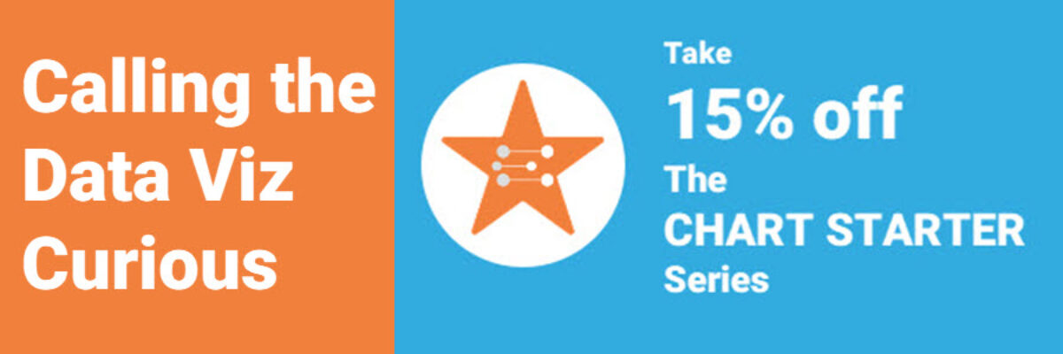
Through January 15, 2020, you can take the Chart Starter Series for 15% off. Just use the code starter15 when you enroll.

If you have been curious about how to get started graphing, this course will take you to the next level. You’ll be the one offering gentle suggestions to other people at the office. This is how you become to go-to guru.
PS. Later this Spring we’ll release a Chart Starter Series for Tableau and R, too.
