While ANY chart can fight for equality, if you plug the right data into it, these four in particular make the story jump off the screen.
4 Chart Types that Fight for Equality
Read More
While ANY chart can fight for equality, if you plug the right data into it, these four in particular make the story jump off the screen.
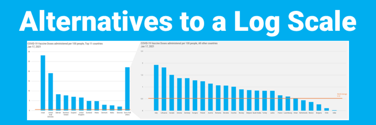
Over in our private Academy Slack group, one of our members asked a solid, totally not snarky question about log scales. They’ve been common in visuals about COVID and there’s a fair question out there about how appropriate those are in graphs aimed at public consumption.
When you spend the bulk of young adulthood in research-focused academic institutions, like I did, you are steeped in a culture that tells you, explicitly or implicitly, that you can’t ever really make a claim. Taking a position on something can be seen as biased. Claiming an insight can be…
The theme of this blog post can be summed up with one emoji: >.< If you aren’t emoji-fluent, that’s the facepalm, a gesture made when you are internally dying of embarrassment over someone’s incompetence. In this case, that someone is me. I have failed to recognize when I was using…
If you’ve ever been in the audience of one of my workshops, you can tell that I was once a teacher. I use the same classroom management skills when I teach 100 adults how to graph as I did when I was teaching 25 kindergartners how to read. Back…
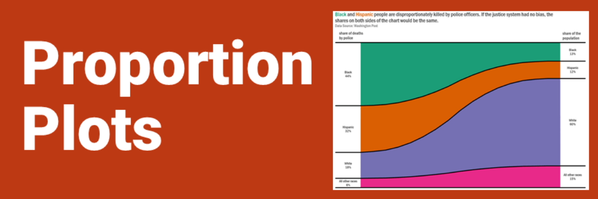
Proportion plots help us compare the share of a population between two metrics. It uses length on the left and right side of the chart and connects the lengths by a band in the middle that swoops a lot if there is disproportionality and stays pretty even if the proportions…
What is Data Visualization? A visual representation ofquantitative or qualitative data. so says Stephanie Evergreen. The strength of this definition is that it is so broad, lots of things fit under its umbrella. But perhaps that is also its weakness because it leaves what counts as data open to interpretation…
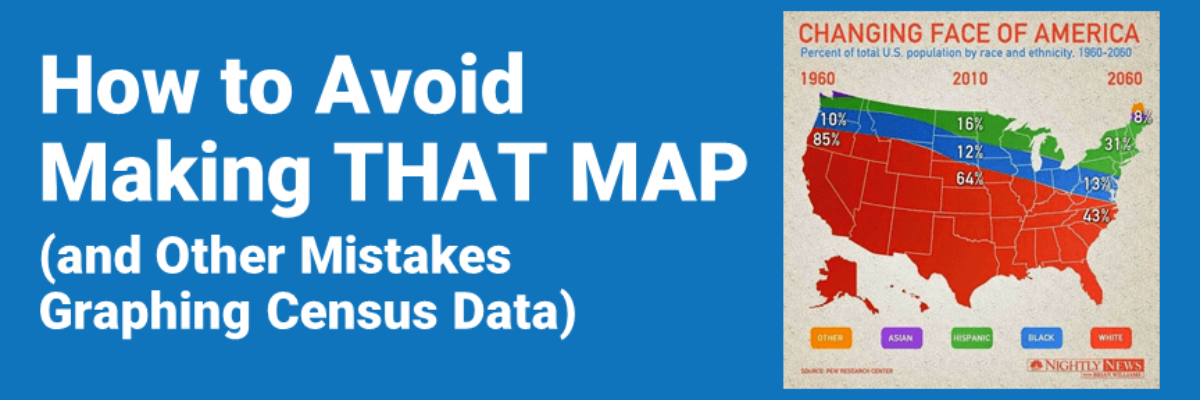
My hot take: Let’s pair a new Census with coronavirus vaccine distribution. A door-to-door campaign. Because Census workers are usually local and trusted and skilled at finding and counting people without doors, too. No doubt, despite the likely incomplete data from the 2020 Census, we will start seeing updated…
Behind every furrowed brow and annoying question about your slide is someone’s ego getting dinged. People don’t like their egos dinged. This tiny bit of emotional intelligence will give you massive insight into how to handle tough data communication scenarios we all find ourselves in at one point or…