
Asked and Answered: Visualizing Demographic Data
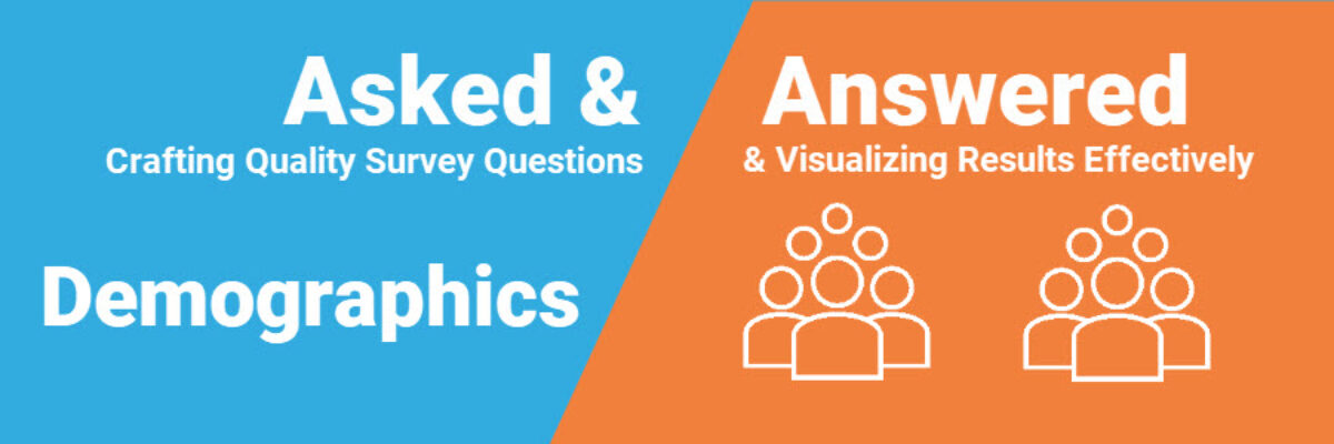
This blog post is part of a series called Asked and Answered, about writing great survey questions and visualizing the results with high impact graphs. Dr. Sheila B. Robinson is authoring the Asked series, on writing great questions. Dr. Stephanie Evergreen is authoring the Answered series, on data visualization. View the Asked counterpart to this post on Dr. Robinson’s website.
I’m not really sure if this still even needs to be said but if you are reporting more than two or three demographic groups, do not use a pie chart.

It is too many wedges for accurate judgement and the default legend requires a lot of eye-bouncing. And eye-bouncing means brain-bouncing and when brains bounce we lose retention.
Of course if you only have a couple of demographic groups to show, you CAN use a pie…

…but recognizing only two demographic groups is becoming increasingly rare. So guess which chart type is back as your go-to, standby, lean-on-me rock solid friend?
It’s a bar chart.

A thick, beautiful, clutter-free, sexy bar chart. It works.
If your demographic data are resulting in very small ns, a bar chart of percentages can be misleading. In these cases, try a unit chart.

Unit charts represent every individual in your dataset. This means you have to be a bit thoughtful about whether you can actually use these. They may end up identifying some people who were expecting to remain anonymous.
Either way, just “showing the demographics” is a problem because it doesn’t carry any meaning. People are willing to give us about 3 seconds of their attention. In that time, they expect to see a point, an answer to “so what?” and charts just “showing the demographics” do not typically do that. We waste the power of a visual when we present people with meaningless visuals. If all you plan to do is “show demographics,” stop right there, save yourself your time, and just pop that data in a table in the appendix.
Alternatively, you can take the opportunity to MAKE a story out of demographic data. Give readers some insight.

Sometimes our demographic data has different meaning when it is laid out geographically, so we map.

JusticeMap.org plotted income as a map and this visual of the Twin Cities area makes it look like people with higher incomes live in the urban Minneapolis/St. Paul area.
But when you zoom in closer…

…it becomes apparent that the actual urban core is much lower income than the surrounding suburbs. Maps make it possible to add depth and nuance to our demographic data stories.
Larger sets of demographic data can also be visualized with a back-to-back chart a.k.a. a population pyramid.

Traditional population pyramids compare male and female by age ranges (again, just two groups, so….) . You would think this graph by USA Facts would look more like a pyramid, in that populations generally have a lot more young children than older folks. However, in the United States, our population pyramid shows a boomer bump. And a millennial bump. Can you see them?
In a population pyramid, there should be a mirror image on either side of the spine, unless there’s something interesting happening somewhere. In this case, I spy more older Black women than older Black men.
In my work, we have used back to back charts to compare two groups even when we are not talking about gender.
You can even combine a population pyramid with a map to get a big picture of demographics over geography, like USA Facts did.

In this tile map, each square represents a state and the population pyramid shows the Black male and female populations by age in that state. While it gets tiny, we can see stories like where Black people tend to live (Texas, Florida, Georgia) and where they don’t (Montana). We can see more pronounced millennial bumps in California and New York, a more narrow base (fewer young babies) in Mississippi and more Black women of all ages in Maryland. So cool!
Demographic data doesn’t have to be boring. You can make something sexy and compelling out of the data, EVEN if you just use a bar chart.
In the other posts in our Asked and Answered series, we provide options for Rating Data, Ranking Data, and Check All That Apply. See you over there.
We go into way more detail on these topics in our books. Dr. Sheila B. Robinson is co-author of Designing Quality Survey Questions. Dr. Stephanie Evergreen wrote Effective Data Visualization.
