Make a Pictogram in Excel

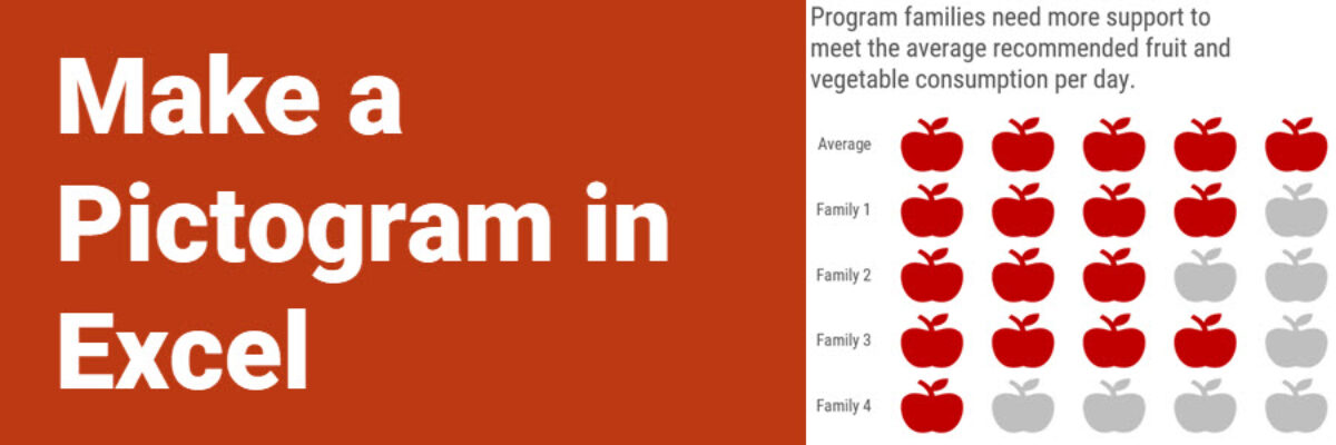
This graph type goes by a lot of names: isotype chart, pictograph, or pictogram. Whichever way, it allows us to use symbols rather than stick with the squares that make up the waffle chart. And it is especially well suited to representing small counts of things that can otherwise be…

Read More

First, Sketch.

Some might claim they look at a blank PowerPoint slide and see a source of hope and possibility, similar to how artists supposedly see inspiration in a blank canvas. I call bullshit on this. Artists did not just walk up to a blank canvas and envision their end product. They…

Read More

Ever Heard of a Dendrogram?

When Jenny Lyons and I were pulling together the revised chapter on Qualitative Visualization in Effective Data Visualization, 2nd edition, we ended up ditching this section on dendrograms. In the list of most-likely-to-use qualitative visuals, this one is probably not in anyone’s top ten. But we still wanted to…

Read More

Super Fast Small Multiple Graphs in Excel

Every time I show this trick to even veteran Excel ninjas, their heads explode. So you have probably heard me preach the gospel of small multiples once or twice before. Breaking a clutter-y graph into a lot of smaller graphs that show one piece of data at…

Read More

Pre-Work Checklists

I have learned all of these lessons the hard way. I now have two checklists I run through before I have a workshop. One handles logistics and it’ll only be useful if you also run workshops. The other helps me determine whether a potential client and I are a good…

Read More

No Unnecessary Lines

The Lines section of the Data Visualization Checklist helps us enhance reader interpretability by handling a lot of the junk, or what Edward Tufte called the “noise” in the graph. I’m referring to all of the parts of the graph that don’t actually display data or assist reader cognition. Create more readability by deleting unnecessary lines.   The default…

Read More

Intentionally Order Your Data

Listen, no one cares about the order we listed the response options on the survey. But most graphs, especially those automatically generated from survey software, showcase the data in that order. And that isn’t useful for anyone trying to interpret the data. Instead, place the bars in order from…

Read More

2019 Call for Mentees

Did you see Vice? There’s a scene (this is no spoiler) in which a young Dick Cheney and Antonin Scalia share a sickening laugh as they agree to an interpretation of the Constitution that allowed a massive power grab for a president. It’s gross. It’s cringe-y. The most disturbing…

Read More

I Failed

This is not news. Today. Yesterday. Every day. I fail all the time. Last week I was playing games that pay real money and failed to get anything out of them. This week, I have so many data visualization fails that I’m already planning a conference talk called The…

Read More

My 2018 Personal Annual Report

This is my last personal annual report. I’ll tell you why. This year most of my metrics went down. At first, due to cultural conditioning that says “more is always better,” I was like Oh no! Before I go further, let’s pause and break that down. I’ve been creating…

Read More