People who are short on time (i.e., most everyone) have these three questions on their mind, in this order.
What’s going on?
What does this mean to me?
What are we (actually, YOU) going to do about it?
The shorthand way of structuring that storyline: What, So What, Now What. When you construct your slides/report/handout/poster in this method, you bring people right along with you because you have aligned the data with their most pressing questions.
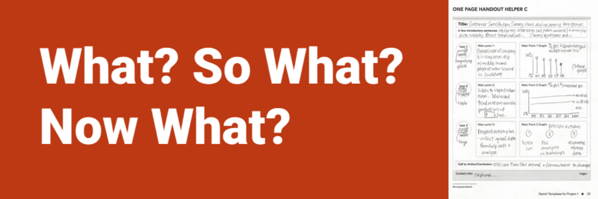
In the Data Visualization Sketchbook, I have provided a handout that fits this What, So What, Now What framework. Here’s my completed example:

What?
Folks are typically crossing their fingers that you’ll cut straight to the chase and tell them the bottom line right up from. The answer to What’s going on? Doesn’t usually involve a discussion of your analysis methods or your data collection strategies. If you do need to discuss those things in order to answer What’s going on, it’ll be brief. What? is answered in statements like:
We are ahead of targets in all areas.
We are behind targets in some areas.
We have some data, but we don’t even know where the targets are.
In my example, What? is Satisfaction with the company is declining among middle income people of color located in the Southeast.

With this kind of structure, your audience is going to be like “Cool, thank you for getting straight to the point, but… so what?”
So What?
In this section, you outline the relevance of this data to your audience. Good lord, I hope some of them see this insight before you have to say it out loud. Even still, you need to say it out loud. And you need to craft it in such a way that your audience can immediately see what’s in it for me. What’s in it for me is SO STRONG that if you don’t speak directly to how this issue will impact the person in the audience, if you don’t make that connection crystal clear, you’ll lose some folks. So What? is answered in statements like:
You’ll lose customers.
You’ll get more funding.
You’ll build a better company and achieve your organizational mission.
In my example, So What? is The decreased in satisfaction is likely to impact other demographic groups as well and will result in a loss of revenue.

You KNOW your audience will perk up when they hear that.
Now What?
Ok, you’ve spelled out the issue and how it directly relates to the audience. They are hooked. Their pressing question is Now what do I do with this new knowledge that I have? This is where you launch into your call to action. You deliver the payload. You land the plane. Pick a metaphor. You give people a course of action to follow or something they should stay tuned for, if you are the one executing the course of action to follow. Now What? is answered in statements like:
Based off of this information, change your strategy.
Call your representative and ask for a policy change.
Stay the course, you’ve got this.
In my example, Now What? talked about next steps in the process, providing an action plan to tackle the issue.

The What/So What/Now What framework encapsulates the information your audience wants in an order they want it. Notice the lack of discussion of statistical significance. Notice the word choices – ones that reflect a common plain language, immediately understood. This framework sets your presentation up for success. When you snag The Data Visualization Sketchbook, you’ll get this blank template to work from and many others, for additional handouts, or slides, reports, dashboards, and even graphs.
In our Academy and The Evergreen Data Certification Program, you can pick my brain and get input from our big-hearted community on your handout-in-progress.
