
Four Ways to Show Projections
Of course we all want to know what will happen in the future. These days folks are looking at data like it has a crystal ball. To the extent that we provide our audiences with projected data, let’s talk about ways to visualize the projected data. Because here’s the thing: The data that isn’t real yet can’t look like the data that is real.
It needs to be immediately clear that there is something different about some of the data so audiences can give the projected data the proper mental caution. Here are 4 ideas. You might even think of others!
Note: This is not about showing uncertainty, such as confidence intervals. I discussed that over here.
Dash That Line

While I usually recommend against any sort of pattern fill in our graphs, this is the one time when it could make sense. Changing the projected line segments from solid to dashed match the story because the dashes indicate “incomplete.”
Fade It

Similarly, a lighter color can be read as “not as strong yet.” So fade the projected data by just using a lighter shade of what you used on the rest of the graph.
Gray It

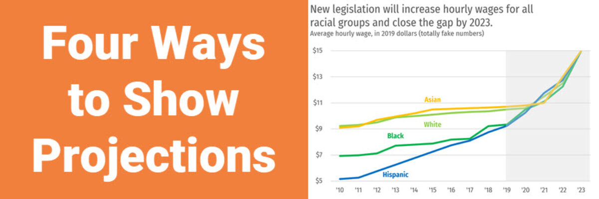
If you end up with a lot of data in your chart and the thought of changing a lot of individual line segments into a lighter color makes you want to get up and go for a walk, well, go for the walk. It’s good for you. Then come back and add a semi-transparent overlay to those sections as another way to mark that data as different.
Range of Possibility

When your projected data could fall within a range, show the entirety of the range in the graph. I made this one by combining a line graph with an area graph. As always, be sure your title is strong, clearly telling your story.
Whichever method you use (maybe one you are now inspired to invent), you gotta do SOMETHING to make it clear that the not-yet-real data is visibly distinct.
