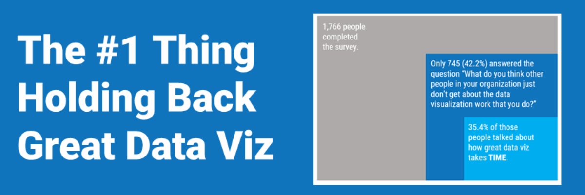
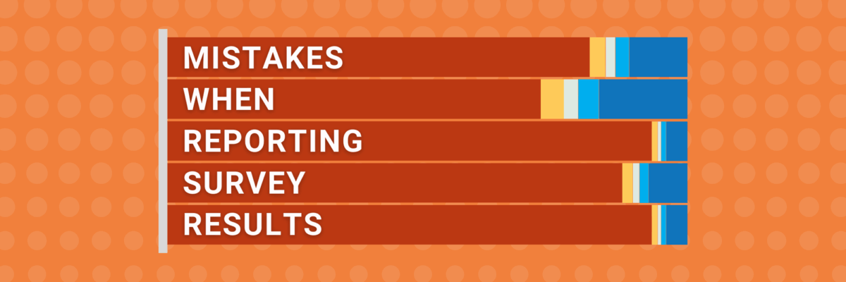
by Stephanie Evergreen | Feb 17, 2021 | Blog, Uncategorized
If you’ve ever been in the audience of one of my workshops, you can tell that I was once a teacher. I use the same classroom management skills when I teach 100 adults how to graph as I did when I was teaching 25 kindergartners how to read. Back when I was a...
by Stephanie Evergreen | Jan 20, 2021 | Blog, Uncategorized
Proportion plots help us compare the share of a population between two metrics. It uses length on the left and right side of the chart and connects the lengths by a band in the middle that swoops a lot if there is disproportionality and stays pretty even if the...
by Stephanie Evergreen | Jan 6, 2021 | Blog, Uncategorized
What is Data Visualization? A visual representation ofquantitative or qualitative data. so says Stephanie Evergreen. The strength of this definition is that it is so broad, lots of things fit under its umbrella. But perhaps that is also its weakness because it leaves...
by Stephanie Evergreen | Dec 9, 2020 | Blog, Uncategorized
My hot take: Let’s pair a new Census with coronavirus vaccine distribution. A door-to-door campaign. Because Census workers are usually local and trusted and skilled at finding and counting people without doors, too. No doubt, despite the likely incomplete data...
by Stephanie Evergreen | Nov 11, 2020 | Blog, Uncategorized
Behind every furrowed brow and annoying question about your slide is someone’s ego getting dinged. People don’t like their egos dinged. This tiny bit of emotional intelligence will give you massive insight into how to handle tough data communication...
by Stephanie Evergreen | Jul 22, 2020 | Blog, Uncategorized
In the introduction to our dataviz workshop at a Fortune 50, the Chief Operating Officer told the room of his employees that he was looking forward to seeing their work improve as a result of what they learned with us. Because, he said, what they wanted to see on the...