
Decade of Data Viz
Well, that just flew by. Ten years ago, I was in the throes of writing my dissertation on Presenting Data Effectively, knowing I had focused on a topic that the world was hungry for, even if they didn’t know it yet. I had collected enough literature and data to know that a better way was possible, despite the fact that there were no viz conferences, journals, or twitter channels to serve as repositories for me. I had Tufte, Reynolds, and Few, none of whom cited research to form their opinions, and a lot of published work spread across disjointed fields to pull together. But even that much made it clear to me that the way we were talking about our data was boring AF and it was a major impediment to use.
Even so, I was presenting at conferences (on other topics) and trying SO HARD to convince my academic co-presenters to try something new. It was hit or miss.
I, in fact, presented this total Death by PowerPoint a decade ago:

I successfully convinced other colleagues to let the visuals work their magic, so that same year, I also presented this slide:

Which I now use as an example of terribly cliché imagery that undermines our credibility.
Looking back at the graphs I was producing a decade ago, I can see that I was already incorporating what I had learned in my research:

Clean lines, gray plus an action color… I was figuring some thing out. But I had not yet figured out how to directly say the insights in the data. I was still assuming others would just look at the data and figure them out.
In another example from that same time frame, it is obvious that the lessons on color had not consistently hit home yet. It looks like I was decorating a kindergarten classroom.

I can see that at this point I knew enough to answer questions with clear, headline-style statements. But I didn’t use color to connect the headline to the graph. And I hadn’t yet realized that the sort order of the graph was an important storytelling tool. I clearly only had bar charts in my graphing repertoire but didn’t know I needed to make those bars thick and sexy for maximum impact.
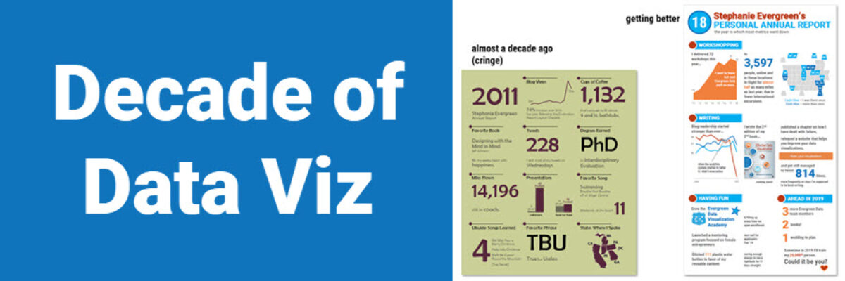
My design evolution can also be tracked through my annual reports, though they aren’t quiiiiiite a full decade:

Some things – like using a grid – stay the same. But I learned more about chart types, supporting narrative, colors (yikes), and design. I can’t be too hard on myself for what I was doing a decade (ish) ago. When you know better, you do better.
The Stephanie Evergreen of 10 years ago had a pretty good idea that the data viz world was about to explode, though I had no idea it was going to be so cool. We have tools! We have conferences! We have books and checklists and workshops! We have even reached that initial peak of “how cool is data viz” and moved on to important issues like “how does this help bring social justice” and “how can I make this more accessible” and its really been something to see.
Particularly in this climate where there’s so much to explore and learn, it is difficult to pause and look back at what was happening 10 years ago. But it is so important to do so because it brings about this notable mix of embarrassment and pride. Did I really think that was awesome? Heck yeah, I did. I think the same thing about what I’m making today. Which means, I wonder what my graphs will look like in another 10 years.
If you are reading this, thinking to yourself, “Geez the stuff I’m making right now looks like what Stephanie Evergreen was making a decade ago,” don’t get sad, get hopeful. Everyone evolves. Keep going and keep growing.
