Delightful, strategy-shifting, and totally free ideas for your next data viz

Professional Standards for Data Visualizers

To my fellow data visualizers: As a field grows in size and maturity, there comes a time to set forth professional standards of conduct, to help us both align our practices and communicate to our potential clients that we are an organized and respectable group of colleagues. Standards need at…

Read More

No More Red Yellow Green

Listen we absolutely must stop using the stoplight color system in our data visualizations and dashboards. You know what I’m talking about. It’s stuff like this: and this It’s the worst thing ever. For several reasons. Here’s they are: The red-yellow-green color coding system isn’t…

Read More

Plain Languaging Statistical Jargon

My main rule of thumb is that you can show measures of variability in your graph so long as you can explain what they mean in an extremely concise subtitle. Translating scientific jargon for a lay audience may be the most challenging aspect of communicating data effectively.

Read More

Three Ways to Show Down is Good

Humans in the western culture tend to see things that trend upward as positive and lines that trend downward as bad. But what if bad is good? And not like my college boyfriend. But in the sense that a decrease is a good thing. Let’s use the example of weight…

Read More

Make a Slopegraph in Excel

Slopegraphs are a newer graph type with powerhouse capabilities. They rely on Excel’s line graphing feature but they don’t necessarily have to show change over time. Slopegraphs play into our ability to judge slope fairly well. For this reason, they are perfect for highlighting the story of how just one…

Read More

I’m a Woman and I Need Data, Too

Dear Good Housekeeping, I needed a few new appliances. My old Shark vacuum cleaner bit the dust for the second time and in the same week my washing machine started eating all my towels. So I was interested in the spread from your Good Housekeeping Research Institute, reporting on its expert tests…

Read More

Theorists Can Have Great Slides Too

I have the coolest gigs. Every year I get to work with the Eleanor Chelimsky Forum keynote speaker to develop a slidedeck that rocks the house. This year, the keynote speaker was Abe Wandersman. I’d seen Abe present in the past and… let’s just say I knew…

Read More

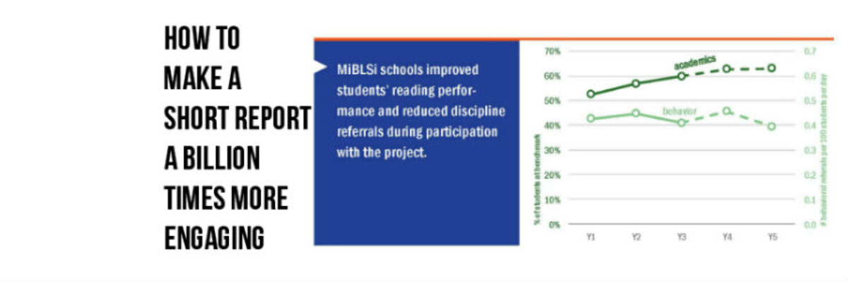
How to Make a Short Report a Billion Times More Engaging

Anna Harms knows when the jig is up. Part-way through my 1 day workshop on Presenting Data Effectively, she knew what change had to happen (and fast). So fast, she didn’t hesitate to walk right up to me and say, “We are working so hard on our reports but there’s…

Read More

President Obama’s Data Visualization

I realize it’s completely taboo to write about current events six months after they’ve happened, but I DON’T CARE. One of my favorite events of the year is watching the enhanced version of the State of the Union. Not the regular view—the enhanced view. One side of the split screen…

Read More