More and more, organizations are on board with the idea of becoming “data-driven.” Collecting data on key indicators is a big step ahead from where many organizations used to be. But being able to interpret that data and share it with others in an intelligent way is equally as important…
How a Dashboard Changes the Conversation
Presenting data effectively changes the kinds of conversations that can happen inside organizations. Better presentations shape an improved culture of decision-making. Let me tell you about a recent example of this. Late 2012 I got a call from an evaluation officer who was working at the Walton Family…
Numbers, Guts, & Culture: How Data Visualization Changes the Conversation
Numbers have power, if you have the courage to use them powerfully. Take these two stories from opposite ends of the 20th Century. The first story is about a man in a steel mill. The second is about the crash of a giant. Charles Schwab had a mill manager whose people weren’t…
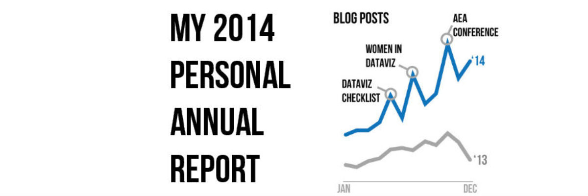
My 2014 Personal Annual Report
Holy smokes it’s been a big year! I finished up my last workshop of 2014 last week and as I got into the cab to head to the airport, a wave of major sleepiness hit me hard. I’ve been super crazy productive and worked with some of the most amazing…
Customizing Colors in Excel
Few things scream “I didn’t try very hard” more than using the Excel default color schemes. Good news is that changing them up isn’t really very hard at all. First, decide what other colors you would like. Maybe pick something from your organizational brand. I used ColorBrewer to come…
Directly Labeling in Excel
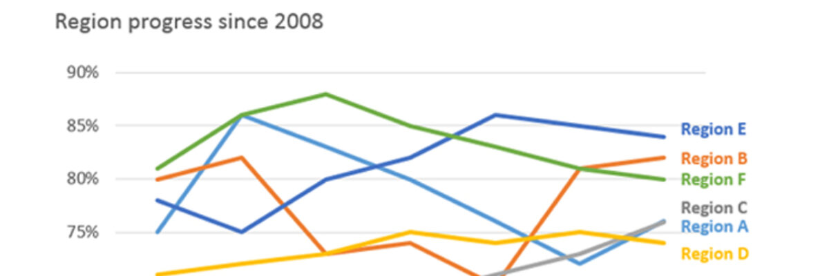
It’s time to ditch the legend. You know – the legend, the key, the thing near-ish the graph that tells the reader what each piece of your graph means. We don’t need it. Legends are actually hard for many people to work with because they put…
Visualizing Likert-type Data: Try Aggregated Stacked Bars
Man, do researchers love Likert-type data! You know what I mean – the kind of survey response options that range from Strongly Agree to Strongly Disagree (or vice versa, depending on your allegiances). Probably the most common way of visualizing that data is via a stacked bar chart, just like…
When It’s OK to NOT Start Your Axis at Zero
UPDATE: This post was written in 2014 and my thinking has evolved since then. Here’s the newest post on how to handle all of your axes. You can also join us at the Evergreen Data Visualization Academy where we banter back and forth about these ideas and apply…
Announcing The Rad Presenters Podcast!
I know some really rad presenters. One of the raddest in Jon Schwabish, which is why I’m absolutely thrilled to launch a brand new podcast with him. The Rad Presenters Podcast! Each episode we will cover a new topic related to presenting – picking great images, the array…
Evergreen Evolving
I took a deep breath and I did it. I changed my Twitter handle. This is a big deal. Things sure are evolving around here. It goes like this: I fell into the field of evaluation. Like most people on the planet (including my parents), I had no idea what…


