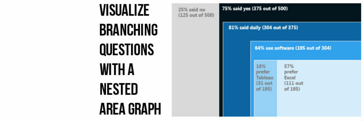
This, my friends, is a nested area graph.
I got this idea from the smart people at Innovation Network. And it is super amazing at visualizing the sequence of survey questions that branch. The kind where it says “if you said Yes, proceed to question 32” and stuff like that. Also pretty well suited for visualizing funneled data.
See how it works? In this case, 25% of the survey respondents said no (and they skipped to the next section). 75% of the respondents said yes. Of that 75%, 81% reported “daily.” And of those, 64% said they use software. You get it? It’s actually pretty darned intuitive.
What makes it work:
- Listing the n’s alongside the main heading in each section. This will help people who are having a hard time wrapping their brains around the visualization because they can see how the n’s carry down into each section.
- This is graphing by area – which is tricky. Humans are bad at interpreting area. So the rule is that the area must be proportionate to the data its representing. As in, a reader should be able to put down a ruler and calculate the area of the “daily” square and it had better be 81% of the “yes” square.
And it is. I started by calculating the total rectangle area by just throwing out some dimensions – I said 6” x 5.63”, or 33.78 square inches, would represent all 500 respondents. The dark blue “Yes” rectangle had to be 75% of that size, or .75 multiplied by 33.78 square inches. That’s 25.34 square inches and I chose to lay that out as 4.5” x 5.63”. I inserted a rectangle in PowerPoint and followed Drawing Tools>Format>Size and punched in those dimensions I just calculated.
To get to the blue “daily” rectangle, I calculated 81% of 25.34 square inches, which is 20.52 square inches. I chose to lay this out as 3.75” x 5.47”. So I inserted another rectangle and sized it up properly. And so on.
Sounds complicated but it really isn’t too hard. You just pick an area to start with for your total set of respondents and divide it up in proportion to the data it needs to represent.
It’s the smartest way I’ve been to display data that is nested in nature. Have you seen other ways to show nested data? Speak up in the comments!

You can find a lot more step-by-step instruction on how to make awesome visuals in my Evergreen Data Visualization Academy. Video tutorials, worksheets, templates, fun, and community. Excel, Tableau, and R. Come join us.
