Delightful, strategy-shifting, and totally free ideas for your next data viz

Marketing Yourself as a Public Speaker

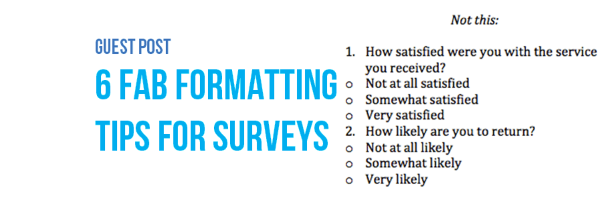
After years of making my way as a public speaker, 40 podcast episodes interviewing other public speakers, and a groundswell of people asking me how to grow their public speaking business, how about we chat for a few about what marketing strategies work and what don’t? What Works Before you…

Read More

Book Club with Alberto, Andy, and Jorge

So far this year we’ve seen a ton of great books on data visualization published! What an awesome time! I got together with Alberto Cairo, Jorge Camoes, and Andy Kirk to talk about our books and the writing process in general. Not sure which of the latest…

Read More

How Middle School Math Pays Off

Dear Mrs. George’s students, Awhile ago I met your teacher at a wedding reception. Her bestie married my father. As one does when engaging in small talk, she asked me what I do for a living. Me: I teach people how to present data. Ever seen a really terrible PowerPoint?…

Read More

Guest Post: 6 Fab Formatting Tips for Surveys

Note from Stephanie: I asked Sheila to write this post because I still get tons of questions from readers about how to take the design I recommend for data visualization and apply it to survey design. I’m not a survey expert, but Sheila is! Hi! I’m Sheila B. Robinson, a…

Read More

Design of an Award Winning Report

So long as we are going to write reports, we might as well make them heavy on the visuals and do everything in our power to make the report easy to navigate, especially in a mobile reading culture. There are lots of ways to do this but one of my…

Read More

Automatically Updating Graphs in Word or PowerPoint

I have so much money in the bank I’m going to give away my number one reporting time saving secret (HAHAHAHAH not at all! I’m giving it away because I love you and I want to make your life easier). This is how you link Excel to your other reporting…

Read More

The Problem with Dashboards (And A Solution)

Folks, I’ve been discussing dashboards forever. I’ve consulted with dozens and dozens of clients on dashboards. And through all of that experience, I’ve discovered that dashboards kind of suck. Don’t get me wrong, I understand the need for a succinct complication of performance on key indicators. It sure beats a…

Read More

How Dataviz Can Unintentionally Perpetuate Inequality Part 2

Last time Vidhya and I posted on this topic, we addressed how the use of color to visualize individuals can do more harm than good. This time Vidhya joins me again to talk about poverty and opportunity. Organizations in the Minneapolis-St. Paul metropolitan area community identified and started tracking indicators…

Read More

The Difference Between Sloppy and Pro

This is the hardest part of design to get right. It’s what differentiates sloppy, weak design from that which looks tight. It’s the use of a grid. Arrangement matters. It’s the sort of thing that gets talked about in design workshops, but people tend to get so caught up by…

Read More

Guest Post: Best Practices for Control, Run, and Pareto Charts

Nicole contacted me with an email subject line: Thank you for the Data Viz Checklist! and she said she’d been using the checklist to overhaul some of her organization’s data visualizations. I’ve invited her here to showcase her before and afters. I’m Nicole Huggett and I recently transitioned…

Read More