Most of the time, I think radar graph are deployed wrong. They are designed to show percentages along several categories – like a bar graph could – but the axis are distributed around a central point, such that the percentages link together and create a shape. Choosing a radar graph, then, is a decent choice when (1) the categories are all connected in some meaningful way and (2) the resulting shape actually means something. And this is not often the case.
Check this radar I found in an infographic on Visual.ly: The three categories here – work performance, late to work, fall asleep at work (who hasn’t?) – are somewhat related to each other. BUT the resulting shape doesn’t actually mean anything. Shouldn’t be a radar. No. Radar.
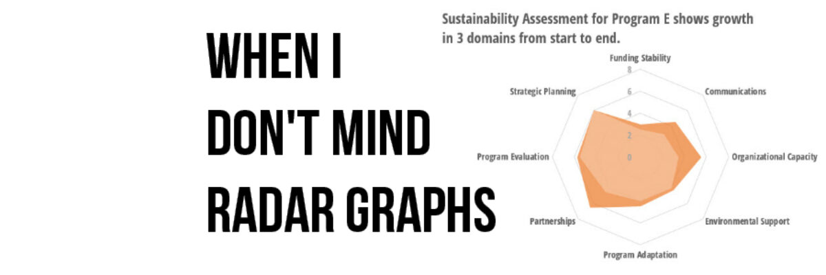
By contrast, radar charts are appropriate when the exact values aren’t totally critical for a reader but the overall shape says something. For example, my friend Kylie Hutchinson pointed me to the Program Sustainability Assessment Tool and this handy thing helps consultants figure out whether a nonprofit is set up for sustainability. The tool measures 8 domains (related concepts – check!).
The folks over at PSAT told me that, at the start of the consulting adventure, organizations are usually high in one domain, middle in several, and low in a couple. In other words, when we sort the data from greatest to least at the beginning and plot it on a radar chart, it looks like a crooked teardrop.

Programs that initially don’t look like a crooked teardrop might alert the consultant to something out of the ordinary.
During the consulting adventure, programs usually increase by a point or more in 3 domains, often choosing domains that initially had low to medium scores. By the time the consulting adventure is over, the program’s sustainability doesn’t look like a crooked teardrop anymore. It looks more like how my pancakes tend to turn out.

The shape gives the overall composite picture of how the program’s sustainability shakes out. The shape is a profile. It means something (check!). The same data as a clustered bar graph doesn’t have the same interpretive power.

Most of the time, I think radar charts are misused, contributing to confusion and clouding the data. Generally, when I see one, I’m annoyed because the visualization doesn’t support understanding the data – and that’s the reason I visualize in the first place. Radar charts *can* work, though, when the data combine into a meaningful shape.
