What’s your point?
Seriously, that’s the most important question to ask when creating a data visualization. And its the first thing I ask a client who sends me data for redesign.
What’s your point?
The answers drive nearly everything about visualizing that data. Here’s how that conversation often goes:
Client: “Thanks for working with us, Stephanie. We have this data from parents and students and right now it is in this bar graph and we are certain it could be displayed better, we just aren’t sure how.”

Me: “I can help with that, Client! What’s your point?”
Client: “Excuse me?”
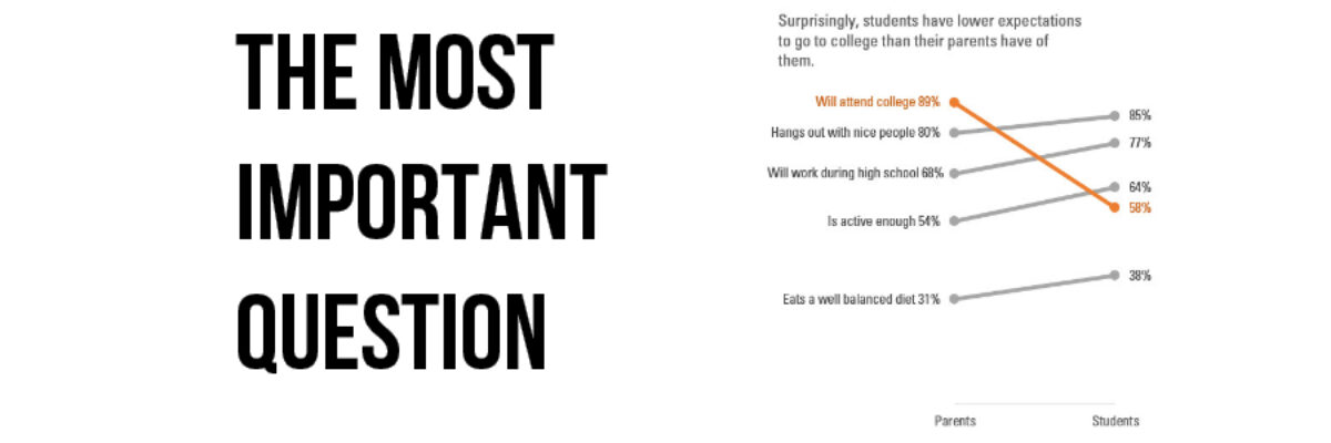
Me: “What’s the point of showing this data about parent and student perspectives? Right now, it looks like you want people to compare parents and students. Is that your point?”
Client: “Actually, no. And that’s the most clarifying question you could have asked. Our point is that generally we expect students to report higher than parents do on all of these questions, but students have way lower expectations to go to college than their parents have of them. That set off some alarm bells for us.”
And this is when I silently pump my fist in the air because Client answered the most important question and now I know how to better display this data.
Me (after I catch my breath from all that fist pumping): “The first thing we are going to do, then, is take what you just said, and make it the headline of the graph. We are going to replace this generic title with your main point. The next thing we will do is swap out a different graph type, maybe something like a slopegraph, since those are pretty good at highlighting when one thing is decreasing a lot and the rest are going up. Give me a day to play with some ideas and let’s talk tomorrow.”
THE NEXT DAY
Me: “Good morning, Client! What did you think of that slopegraph I sent you?”

Client: “It really does say exactly what we originally thought we needed to show. But I talked to my colleagues more after our call yesterday and asked them ‘What’s the point?’ and we decided that the real bottom line point was that so few students have expectations to go to college. Forget the parents – that’s a secondary issue right now. ‘What’s the point?’ really helped us hone our thinking.”
Me: “Ah well in that case, you have other options for showing that point.” *telepathically sends new visual possibilities* “Maybe one of these?”

Client: “These are all right to the point. We will choose one today.”
Asking the most important question sharpens the thinking and the messaging surrounding the data and, in doing so, reveals the best way to visualize the data. When you get stuck with your graph, keep asking “What’s the point?”
