I know some really rad presenters. One of the raddest in Jon Schwabish, which is why I’m absolutely thrilled to launch a brand new podcast with him. The Rad Presenters Podcast! Each episode we will cover a new topic related to presenting – picking great images, the array…
Evergreen Evolving
I took a deep breath and I did it. I changed my Twitter handle. This is a big deal. Things sure are evolving around here. It goes like this: I fell into the field of evaluation. Like most people on the planet (including my parents), I had no idea what…
Declutter Dataviz with Small Multiples
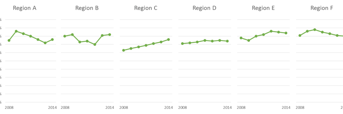
Are you making graphs that look like this crap? I won’t make you raise your hand. But let’s just agree not to do this, yeah? It’s SUPER hard to compare the tops of a bunch of bars. Two side by side bars per region ain’t so bad but beyond…
The Easiest Way to Make Bullet Charts in Excel
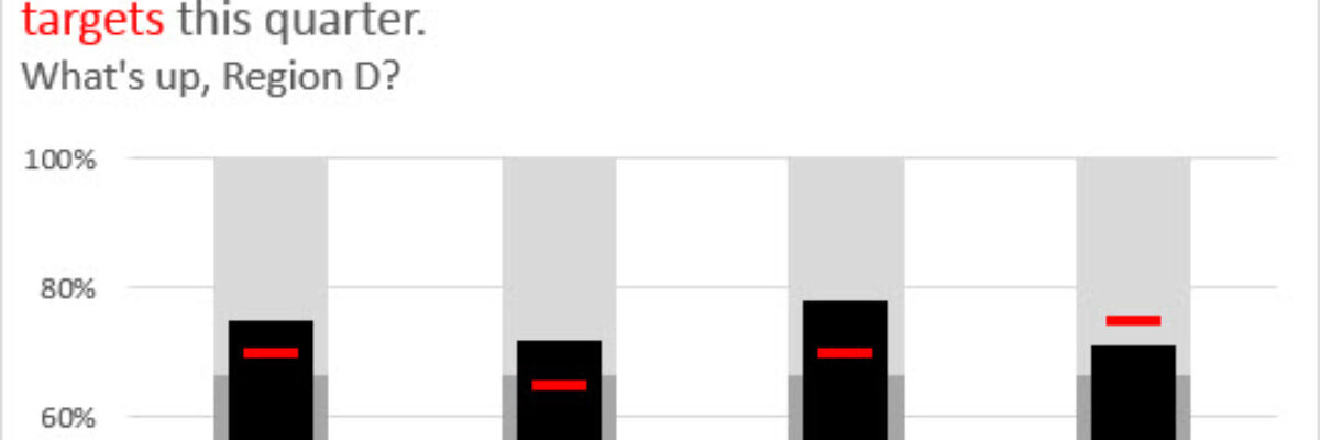
There are lots of ways to make bullet charts, some easier than others, some better suited for specific visualization contexts. Hell, there are plug-ins you can purchase that make it a snap. Except when my plug-in broke and I had to remake about a…
Guest Post – Charting Confidence Intervals
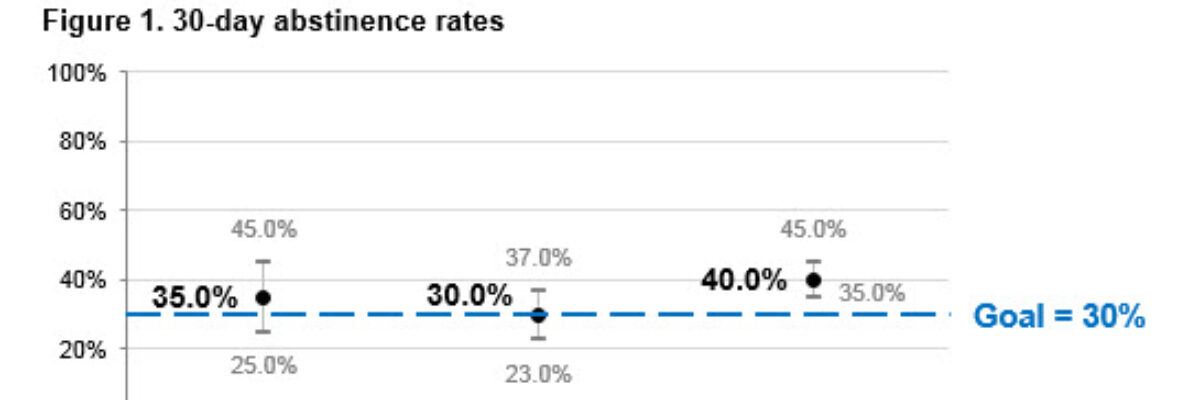
Hi there! I’m Angie Ficek and I’m a program evaluator at a small evaluation consulting firm called Professional Data Analysts, Inc. (PDA) in Minneapolis, MN. In a previous post, Stephanie wrote about adding standard deviations to a dataviz. I responded to her post with an example of…
What the Hell is Wrong with the Projector & How to Fix It
Meet a hero. This is Kailen Brooks. A few months ago, I was giving a workshop on data visualization to about 40 people at the AEA Summer Institute when pretty much everything that could have gone wrong almost did. Someone’s spilled drink ran dangerously close to my computer.
Adding a Benchmark Line to a Graph
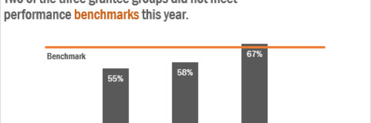
This simple line packs so much power. Adding a benchmark line to a graph gives loads of context for the viewer. Here’s how to make one right inside Excel. It’s so easy you might pass out. My data table looks like this: I have my data and I have the benchmark…
Embracing Data Visualization in Evaluation: A Management Perspective
Friends! I’m so happy to have Rakesh Mohan guest blogging for me. He is one helluva guy. He is the Director of the Office of Performance Evaluations, an independent agency of the Idaho State Legislature. In other words, his eval clients are lawmakers. You ask me for examples of reporting in…
An Incomplete List of Females in Data Visualization
I rewrote this post 4 times, in an effort to give it a calm and professional tone. And then I thought “Ah fuck it, this is my blog and I can say whatever I want.” I’m writing this post because I just listened to an interview about data visualization. It…


