Delightful, strategy-shifting, and totally free ideas for your next data viz

State of the Union 2016 Slideshow

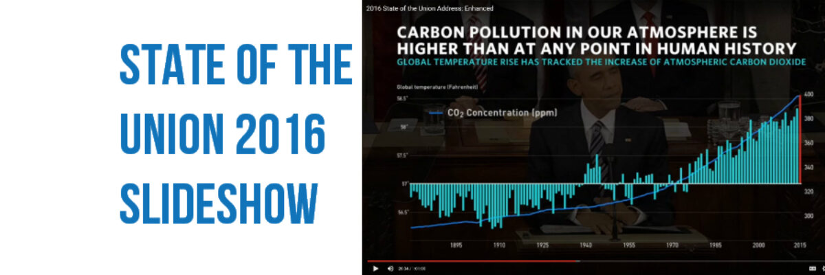
Dudes, the State of the Union is my Superbowl. I look forward to this event like some people anticipate the Oscars. This is my deal. Why? Because the enhanced version of the SOTU features a data-based slideshow, a perfect study in how graphics can help underscore a point. And, as…

Read More

Data Viz Challenge Redesigns!

Last week I launched a challenge to redesign financial info from the Gates Foundation annual report. I was looking for entries that made the data more engaging than a table, matched the level of design of the rest of an annual report, and still reported each element originally presented…

Read More

Data Viz Challenge: Gates Annual Report Financials Page

So! This was fun. Yesterday I published a post where I pleaded with nonprofits and foundations to add viz to the financials page of their annual report, which is usually just presented as a table of numbers. I shared two redesigns that I made. The one I remade for…

Read More

Data Visualization for Non-Profit & Foundation Annual Reports

Annual reports are where non-profits and foundations pull out their designer big guns. This is where they show off their muscles, like studs on the beach. The annual report is the place where an organization oils its accomplishments til they shine. The annual report is so important, most organizations still…

Read More

My 2015 Personal Annual Report

Yowza, what a year! And it is only December 2! I’m writing from my hotel room in Boston. This week I’ve been working with Annie E Casey Foundation (Baltimore), Education Development Center (Boston), and the Ad Council (New York City) – and what a set to round out another awesome year…

Read More

What #TLDR Means For Your Report

The short answer: It means your report is boring. #TLDR means Too Long, Didn’t Read. And it’s what people say/tweet/think when they get a report that is so long and cumbersome that it’s a burden to read. That said, the long report is not going away any time soon. I…

Read More

Holiday Swag for Your Favorite Data Nerd

Introducing new designs on practical, household items. I’m talking about graphs on flasks! Your favorite data nerd is going to love one of these. BAM shopping done. Both designs says “DRINKS FOR DATA NERDS.” They have a y-axis which is the amount of liquid remaining in the flask and an…

Read More

Professional Standards for Data Visualizers

To my fellow data visualizers: As a field grows in size and maturity, there comes a time to set forth professional standards of conduct, to help us both align our practices and communicate to our potential clients that we are an organized and respectable group of colleagues. Standards need at…

Read More

No More Red Yellow Green

Listen we absolutely must stop using the stoplight color system in our data visualizations and dashboards. You know what I’m talking about. It’s stuff like this: and this It’s the worst thing ever. For several reasons. Here’s they are: The red-yellow-green color coding system isn’t…

Read More