Delightful, strategy-shifting, and totally free ideas for your next data viz

Spectrum Displays

When presenting qualitative data, choose visuals that are broad enough to display the full set of data but are also visualized in a way that allows viewers to pull stories from the data. This is a hard balance to strike, and a spectrum display can do so very well. A…

Read More

How to Communicate Odds Ratios

Odds ratios are tricky. It isn’t actually all that hard to come up with some decent ways to visualize them. The tricky part is interpreting the results in a way that makes sense to average readers. How do you put the phrase “odds ratio” into a clear and easily interpreted…

Read More

Announcing The Interactive Data Visualization Checklist

If you’ve been anywhere near the world of graph making in the past several years, at some point someone probably sent you the Data Visualization Checklist, developed first in 2014 by me and Ann Emery. We built the checklist based on the best available research I was seeing via…

Read More

Should You Make an Infographic Resume?

A family member works in IT at a large corporation. She recently forwarded me this resume they received for a job opening. Apparently, it had been passed around the interview committee with the subject line “Best/Worst Resume Ever?”. I personally liked this one for the fact that I know…

Read More

Announcing: The Evergreen Mentoring Program

I can’t stop thinking about Harvey Weinstein. And as soon as I think of him, I remember all of the times I’ve been intimidated, harassed, undermined, or overlooked because I am a woman. With a deep breath, here are a couple of those experiences. When I was a graduate student,…

Read More

My 2017 Personal Annual Report

Every year at Evergreen Data continues to be the best year ever. When I was younger, I knew my dream job would include meaningful work, awesome people, data, writing, and travel. I just didn’t know at the time how to put all of those things together in one place. Thank…

Read More

Guest Post: Getting Started with Graphic Recording

By Lydia Hooper, Fountain Visual Communications Data visualization professionals often focus on numbers, helping to tell the story of what, when, where, and how much. But more often than not organizations first need to better understand the why and how. Before there is a need to communicate key insights from…

Read More

Qualitative Chart Chooser 3.0

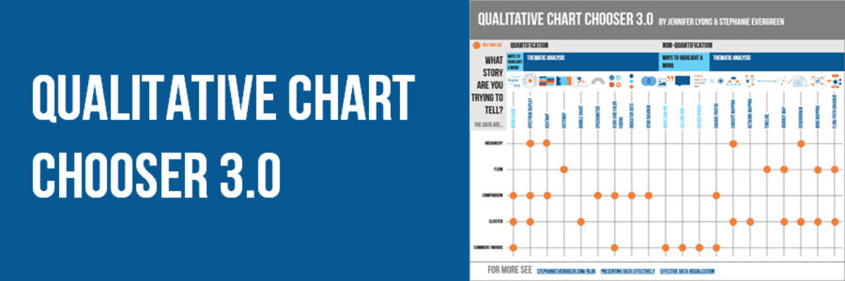
Why isn’t qualitative data viz as well developed as quantitative data viz? Here at Evergreen Data, we are trying to tackle that. Qualitative data gives us more power to engage people’s hearts and minds. We are able to extend our data story to a more personal level. When we are…

Read More

Book to Read: Innovative Evaluation Reporting

When I first started talking about presenting data effectively, Kylie Hutchinson came up to me in her bad ass black leather jacket and said if I needed a mentor, she was available. That’s how cool she is. When I talk about how effective it can be to introduce the element…

Read More