Few things are more tragic than excellent non-profits doing great work to help struggling families but can’t tell their story effectively. In this blog post, I’m going to step you through the redesign of a one page handout I created for my clients at the Education Development Center. Their…
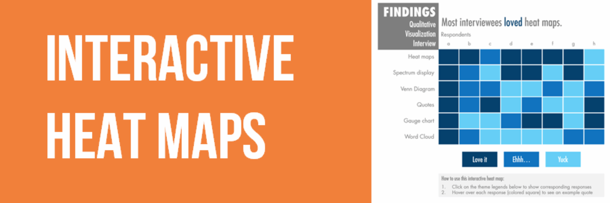
Interactive Heat Maps
One of the most common ways to analyze qualitative data is through thematic coding. Thematic coding allows us to move beyond the visualization of word or phrase frequency, like in a word cloud, and start to examine attributes and stories that emerge from the data. The New York Times…
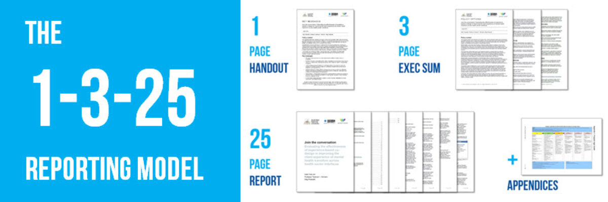
The 1-3-25 Reporting Model
It’s time to talk about how a highly visual, well-formatted recommendations page doesn’t have much impact when it is buried on page 104. This is how we make reporting less cumbersome, particularly in a digital reporting era. Of course your reporting will probably include a slidedeck. I mean, you could…
The Wrong Kind of White Space
Long-ish reports are probably never going away entirely, so let’s make them suitable for a digital reading age. In the olden days, when we printed reports, they often had extra blank pages at the front and back. It probably gave printed materials a sense of refinement or maybe its used…
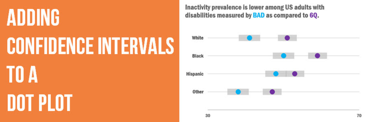
Adding Confidence Intervals to a Dot Plot
Evergreen Data Visualization Academy member Dana McGuire recently wrote me to ask about her dot plot. She said, “Would there be a way to show the bar or confidence interval somewhere? I have gotten positive feedback on the look of the graph overall, but it is a scientific conference…
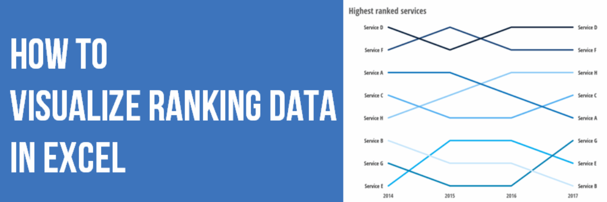
How to Show Ranking Data in Excel
Danielle, a member of my Evergreen Data Visualization Academy, submitted a question to our monthly Office Hours webinar about how to show ranking data. She sent this survey question: There are eight categories below. Rank each item to continue to the next page. Rank the following services in order…
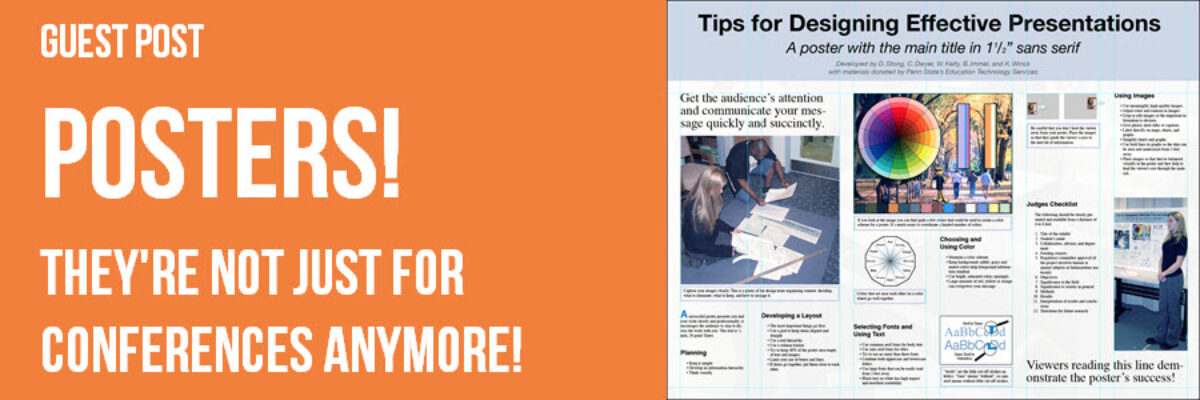
Guest Post: Posters – They’re Not Just for Conferences Anymore!
SE Note: I almost never make posters but I know they are a hot reporting tool for many of you, so I asked poster veteran Kylie Hutchinson to share her secrets. Posters are an important, but often overlooked, dissemination tool for visually communicating your results. Traditionally, we think of posters…
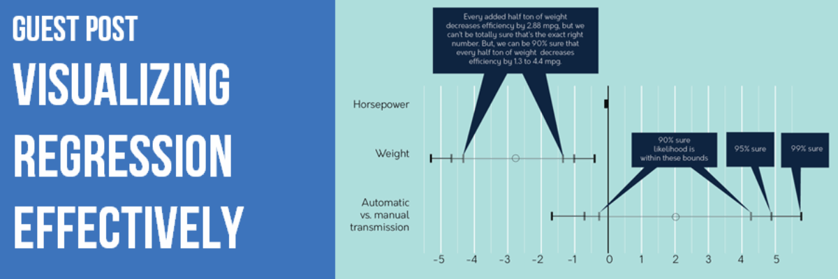
Guest Post: Visualizing Regression Effectively
Updated Note from Stephanie: This blog post generated a lot of discussion. Some of that is in the comments here, some of that has been deleted, some of it came from Twitter and via my inbox. Be sure to read the comments to get a sense of the critique. At…
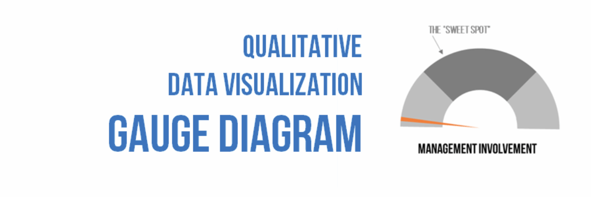
Qualitative Data Visualization: The Gauge Diagram
When we debuted our Qualitative Chart Chooser, we promised to dive into detail on specific visualizations, so let’s kick it off by discussing how and when to use one of the most derided charts of all: the gauge diagram. I know, I know… I am sure you are…
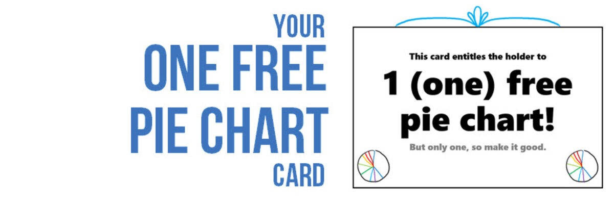
One Free Pie Chart
If I could, I’d ban pie charts. Not because they are inherently bad, but because most people don’t know the pie chart’s tiny range of acceptability. Here it is: Pie charts are ok if you don’t need the numbers on the wedges to get the story. That usually means you’ll…


