Delightful, strategy-shifting, and totally free ideas for your next data viz

Announcing Chart Chooser Cards

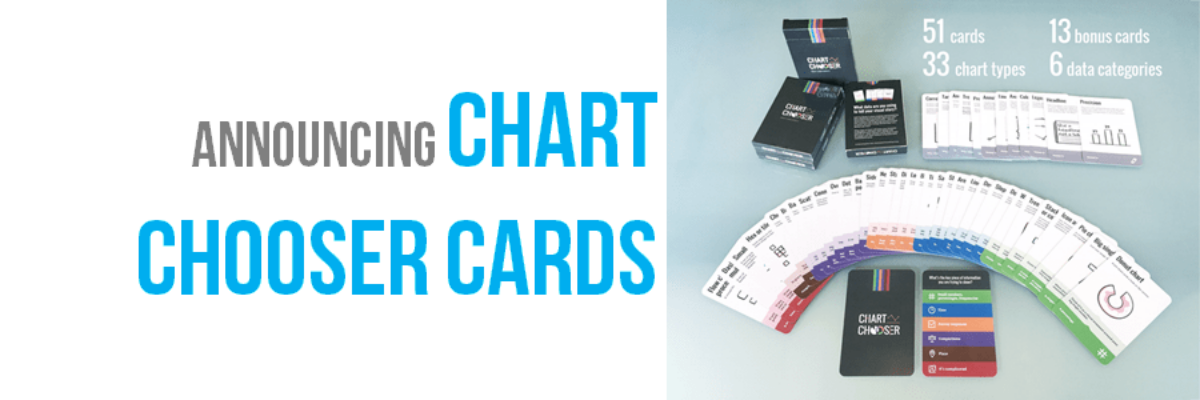
Update: After a successful Kickstarter campaign where we raised over 1,000% of our goal, the cards are in production and you can now order a deck, an infographic, and our templates from our permanent website. Thanks for your support, lovely people. Chart Chooser cards are simple and easy…

Read More

Strong Titles Are The Biggest Bang for Your Buck

If you do nothing else to improve a weak visualization, you’ll still seriously improve its interpretability by giving it an awesome title. Generally we use weak titles that don’t really tell us the point of the visualization: I think this is because we make our graphs in Excel,…

Read More

Your Data Visualization Secret Weapon

You want to know the trick to fixing most scary data visualizations? The answer to horrifying stuff like this?   What does one do when the graph gives you the shivers?   http://viz.wtf/post/142740495532/spaghetti-sans-meatball   The answer is always going to be:…

Read More

Evergreen Data Visualization Academy

The Data Visualization Academy is only open for enrollment twice a year. Come get select access to my best data visualization tutorials and advice. Four years ago today, I took the leap from salaried employee to independent consultant. Since then, I’ve worked with scores of organizations to help them use…

Read More

Make It A Game

I spend a lot of time talking about really serious data with incredibly focused people. I love them and I love my job. But sometimes I need to balance that out with some Lucky Charms. So while eating my bowlful of magically delicious sugar bombs the other day and looking at…

Read More

Exporting Graphs from Excel

I love when readers send me questions that I can turn into blog posts. The question: We often make our graphs in Excel and pop them in to reports or slides, but the transfer usually causes the formatting to get all wonky. How can we get print-quality graphics out of…

Read More

Timelines, 4 Ways

The least helpful timelines I’ve ever seen are these: where time is basically bulleted, as if each of these intervals is equidistant and as if a bunch of text is the best way to communicate something inherently not based in narrative. You are basically saying, this journey is…

Read More

What I Do: Before and After Business Slides

I help people design the best visual supports for streamlined conversations and decision-making. That’s just what New Client needed. He called to say “I need to look great at this meeting.” And by the time he got to that meeting, he looked great *and* he presented his qualitative and quantitative data…

Read More

My New Favorite Graph Type: Overlapping Bars

Why have I fallen in love with this graph type? I think its because its such a great way to visualize the comparison between two things, when one is inherently a part of the other. In recent client projects, I’ve used these to show actual v. budgeted amounts. Or individual…

Read More

Marketing Yourself as a Public Speaker

After years of making my way as a public speaker, 40 podcast episodes interviewing other public speakers, and a groundswell of people asking me how to grow their public speaking business, how about we chat for a few about what marketing strategies work and what don’t? What Works Before you…

Read More