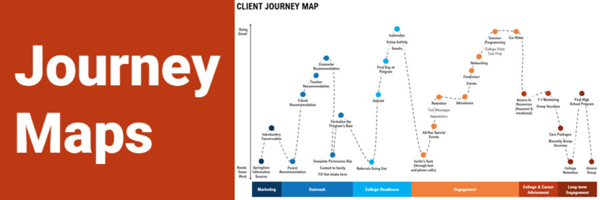
Delightful, strategy-shifting, and totally free ideas for your next data viz

Sidebars are Your Friend

Sidebars are an unsung hero of reporting. Sidebars are a way to offload details such as your methods or caveats about your data that are related but not a direct part of the narrative. Sidebars are not call out boxes. Call out boxes are for giving a tiny shout out…

Read More

Why No One is Reading Your Report

Here’s the hard truth: Your report probably sucks. Mine sure did. The heart of your content is likely fine, maybe even helpful. But, if you are anything like the hundreds of reports I see every year, the entire set of cultural norms we have somehow developed around reporting is just…

Read More

Use Proximity for Better Data Storytelling

Recent clients, Planned Parenthood Federation of America, faced a design problem so common they didn’t even know it was a problem. They were working on communicating some data from a program that aims to educate on healthy sexuality and reproductive health. They surveyed participants at the start and end of…

Read More

Makeover: Health Data Edition

By far, my favorite emails to receive are from clients bragging about the beauty and impact of their work after our workshop. I just got one of these the other day from Becca Scranton at Arizona Department of Health Services. After thanking me for the workshop, she wrote, “Thanks to…

Read More

Launch That Consulting Practice

A while back, I announced that I was launching a mentoring program for women who are seeking to catapult their new business into the real world. I said I would take 4 mentees for a year. I had 70 applicants. I spent days reading through each woman’s essay, learning…

Read More

Spectrum Displays

When presenting qualitative data, choose visuals that are broad enough to display the full set of data but are also visualized in a way that allows viewers to pull stories from the data. This is a hard balance to strike, and a spectrum display can do so very well. A…

Read More

How to Communicate Odds Ratios

Odds ratios are tricky. It isn’t actually all that hard to come up with some decent ways to visualize them. The tricky part is interpreting the results in a way that makes sense to average readers. How do you put the phrase “odds ratio” into a clear and easily interpreted…

Read More

Announcing The Interactive Data Visualization Checklist

If you’ve been anywhere near the world of graph making in the past several years, at some point someone probably sent you the Data Visualization Checklist, developed first in 2014 by me and Ann Emery. We built the checklist based on the best available research I was seeing via…

Read More

Should You Make an Infographic Resume?

A family member works in IT at a large corporation. She recently forwarded me this resume they received for a job opening. Apparently, it had been passed around the interview committee with the subject line “Best/Worst Resume Ever?”. I personally liked this one for the fact that I know…

Read More

Announcing: The Evergreen Mentoring Program

I can’t stop thinking about Harvey Weinstein. And as soon as I think of him, I remember all of the times I’ve been intimidated, harassed, undermined, or overlooked because I am a woman. With a deep breath, here are a couple of those experiences. When I was a graduate student,…

Read More