When I first started talking about presenting data effectively, Kylie Hutchinson came up to me in her bad ass black leather jacket and said if I needed a mentor, she was available. That’s how cool she is.
When I talk about how effective it can be to introduce the element of fun into our data presentations, I always talk about Kylie’s work. That’s how cool she is.
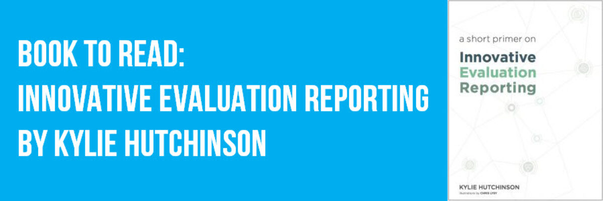
And now she wrote up her ideas into a book. That’s how cool she is.
I love this book so much. You should read it. Here are a few of my favorite parts:
Develop a Communications Plan
Kylie guides readers through a process of detailing each of their main audiences, how those people want to receive information, how much that could cost, when they need it, and where they fall on the priority list.

In my workshops, clients usually express frustration that they have multiple audiences and don’t know how to meet everyone’s reporting needs. Kylie’s straightforward activity can clarify who gets what, when, so that the action plan is clear.
Layer Your Content
Kylie and I both talk about how we need to multiple report formats, each with a different number of details, to form a bit of a bread crumb trail so that audiences can always get as much information as they would like from us without having to wrestle with a long report. Kylie refers to this as layering the content and she uses a hamburger metaphor to explain what layering looks like.

Not everyone can digest the burger, ya know? So let’s give them some other edible pieces.
Physical Items
Perhaps my favorite part of Kylie’s work is her focus on the use of physical items to get audiences engaged with data. Sometimes a dot plot just won’t be enough to get your audience geeked. Sometimes they need to have fun. And Kylie has loads of ideas, many of which are available for free on her website.

This is Kylie’s reporting cube, a tool I have used with clients in the past. You type your data into the textboxes, print out the sheet, and cut and fold as directed until you have formed this 3D physical item. Then audiences roll the cube (it’s not really a cube, and this is where I have a bone to pick with Kylie) and whatever they land on, they talk about. What a great way to make data digestible for people who are normally data scared.
Kylie’s new book has loads of just pure gold. It’ll make you better at reporting, whether or not you work in the field of evaluation. Her ideas are widely applicable.
PS. Her section on flow charts is my new mantra. It’s incredibly insightful.
PPS. Don’t be put off that the book’s title includes the word “evaluation.” Even if that is not your field, this book is for you. If you ever need to report your work out to people and you find yourself having a hard time engaging them, you need this book.
