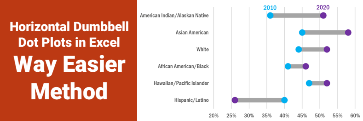
Delightful, strategy-shifting, and totally free ideas for your next data viz

508 Compliance Tools

If you aren’t worried about being 508 compliant, you should be. A part of the Americans with Disabilities act, being 508 compliant means that the stuff you post on your website should be accessible to anyone with a disability. Back when this was first announced, in 1998, it only applied…

Read More

Arranging Logos on a Slide

Even skilled graphic designers are frustrated by the never-perfect task of arranging logos on a slide. So don’t feel bad. It’s a pain, no question. You probably have to arrange logos on slides or a website to thank sponsors, acknowledge partners, or brag about your client roster. In this example,…

Read More

Histomaps

The histomap is one of the oldest, and most famous, ways to present qualitative data over time. The first example was created by John B. Sparks in 1931, titled “The Histomap: Four Thousand Years of World History.” At the time it was printed, the chart was marketed as a clear,…

Read More

Graph Text Should Be Horizontal

In languages based on the Latin alphabet, we read horizontally, from left to right. Reading on a diagonal produces cramped necks. Reading vertical text is just not going to happen. So, as much as possible, the text in our graphs should be horizontal. Let’s walk through a demo. I was…

Read More

The Link Between Graphic Design and Report Use

Though I have a PhD, I left academia to become a consultant and it was the best decision I ever made. But I’m still a research nerd at heart so when I had a chance to run a study that examined the link between graphic design and report use, I…

Read More

Book to Read: Designing Quality Survey Questions

I still have a landline. I’m not an old, but I conduct a lot of webinars about data visualization and reporting and the sound quality is so much better on a landline. But it is a midterm election year which means my phone has been ringing several times every day…

Read More

Capture Qualitative Data with Change Photos

Engaging our audiences in the complex, intricate stories of our qualitative data can be difficult. Make qualitative comparisons come alive with change photos or graphics. The hurricane in Puerto Rico left many devastated and without power, homes, and community. It is hard to imagine the damage that was done. One…

Read More

Ways to Visualize Cost-Benefit

Cost-benefit analysis a way of saying “Yes, this program has great impacts… but it’s super expensive.” You’ll often hear the results of cost-benefit analysis in the news, phrased as “For every dollar we spend on this program, we save $$$.” Clients at the University of Alaska, Anchorage (I HAVE THE…

Read More

Data + Food

I like to think I’m a foodie but actually I just love to eat. We all do! Food gets people to the meeting. Food grabs folks’ attention. Food gets people talking (between bites, let’s hope). So let’s play to the player and figure out how to get people engaged in…

Read More