Data visualization is so cool because it helps you see things that would otherwise take a looooooot of effort. Here’s an example.
Some very sweet clients in Maricopa County, Arizona (that’s the greater Phoenix area, friends) had a habit of presenting super important data in the most hard to digest way: a table.

Tables are super hard for people’s brains. Our brains can’t really process more than 3-5 chunks of information at once and this table has, uh, a little more than that. Our brains have a hard time tracking a row of numbers, comparing back and forth to see where there were increases or decreases, which race’s uninsured rates are higher than another, and when. Sheesh. It’s just too much.
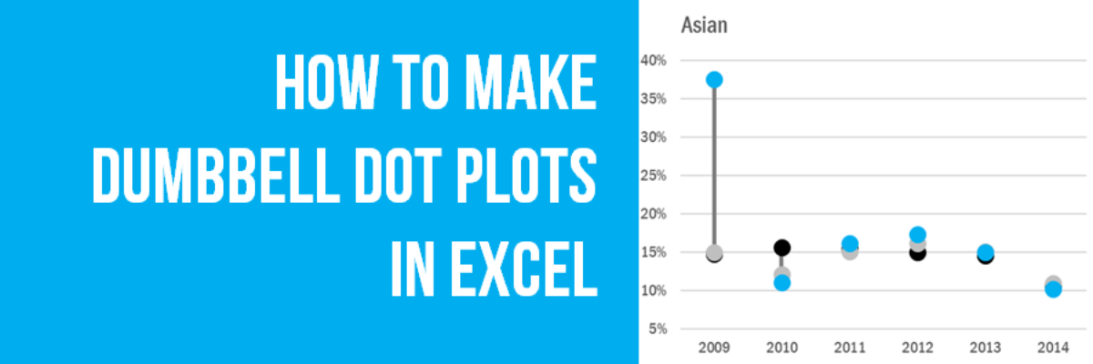
So we plotted this data into a vertical dumbbell dot plot. God, it’s amazing.

Just look at this thing. For the first two races, the dots are clustered close together, meaning people of those races in Maricopa had similar uninsurance rates as compared to the whole state of Arizona and the whole United States. Ok. Then things get totally crazy. I mean, the blue Maricopa dots are all over the place for American Indian/Alaska Native. The very high blue dot in 2009 for Asian is so stark, it actually makes me think there was something up with data collection that year. Seriously, wow! A table ain’t going to tell you that!
So. Here’s how to make that dumbbell dot plot:
Hold down the Control key while you select all the data for one race. It’ll be in three different rows in this table. Don’t worry about the locations in column A or the years in row 1. Then insert a line graph with markers.

Then right-click in the graph and click Select Data. You’ll see this new box open called Select Data Source. On the left are the three series of data you highlighted. But they all say the name of the race, not the location. So click the Edit button in the middle and select the location cell for Series Name. Do this for each of the three series.
On the right side of this box, it says Horizontal (Category) Axis Labels and right now the box just has 1-6 listed. This is where the years should go. So click the Edit button and select the cells with the years.
Now that the right labels are in place, let’s adjust the line with markers. We essentially want to get rid of the line and keep the markers. So right-click on a line, and select Format Data Series. In the Line menu, select No Line. Then in the Marker menu, make the marker larger and adjust the colors. Repeat these steps for each line.

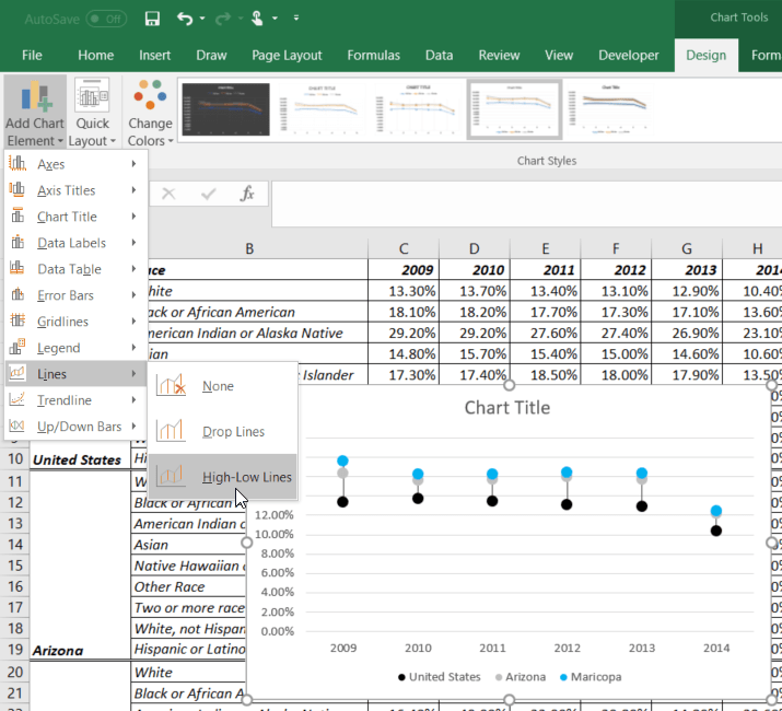
The critical hack to make this into a dumbbell dot plot is to add the vertical line that connects the dots. It’s easier than you think. With the chart highlighted, you should see a dark green tab that says Chart Tools. Under it you’ll see 2 tabs (newer versions of Excel) or 3 tabs (older versions). If you see 2 tabs, click in Design and look for the Add Chart Element button on the left. Open that and select Lines and then High-Low Lines. Boom! If you see 3 tabs, click the center Layout tab, look for the Lines button, then select High-Low Lines. Old school Boom!
Adjust the y-axis scale. Since this graph just shows White data, we know we will need many more graphs. So look for the highest value in the table. It’s 40%. Set the max for the y-axis scale to 0.40. Then adjust fonts and legend placement and title label.

Copy and paste this graph next door. Right-click on your new graph and go back into Select Data. In the 3 series listed on the left, edit each one and select new series values for your next set of data. This will keep the colors, fonts, and scale intact, but the graph will visualize uninsured rates for a new race and the whole process will take you probably 30 seconds. How very cool.
One of the many benefits of data visualization is that it helps you gain insights in the data that you wouldn’t otherwise be able to see without significant effort. Tables bury information because they are so hard to digest. If our job is in any way to communicate our data, a table won’t cut it. Visualize! Maybe with a dumbbell dot plot!
We have video help for this tutorial plus instructions for Tableau and R in our Academy and The Evergreen Data Certification Program.
