This blog post is part of a series called Asked and Answered, about writing great survey questions and visualizing the results with high impact graphs. Dr. Sheila B. Robinson is authoring the Asked series, on writing great questions. Dr. Stephanie Evergreen is authoring the Answered series, on data visualization. View the Asked counterpart to this post on Dr. Robinson’s website.
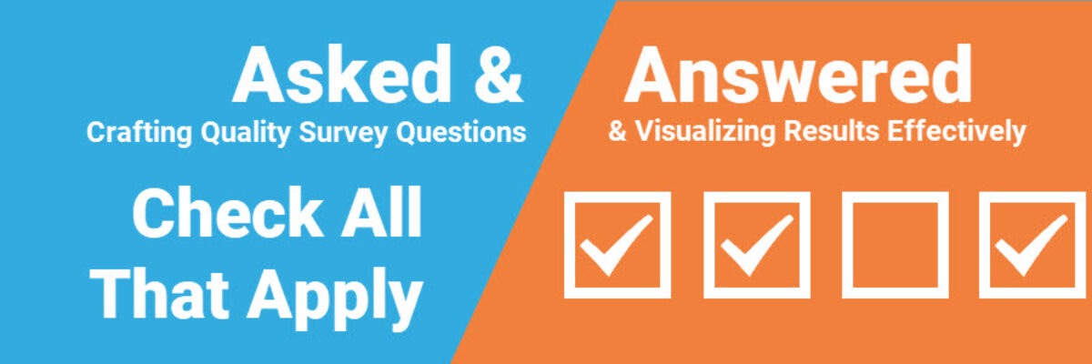
In a Check All That Apply situation, respondents can – and usually do – choose more than 1 answer. This means the responses will never total to 100%. And that’s why this data can not be visualized as a pie chart.

Which means a bar chart, ordered greatest to least, is your alternative. But that can have many variations.
In this example, created by Dr. Sheila B. Robinson, she used 100% stacked bars for each survey item, to indicate that each item could have totaled 100% if all respondents checked that box. This is a nice way to show that, while the response options as a whole can’t add to 100%, each option on its own CAN. Plus, look at the cute icons.

If bars or stacked bars are too boring (I don’t think so but some people have OPINIONS) you can keep moving in the direction of cute icons and turn your data into a Lollipop chart.

If you wanted to compare Check All That Apply responses between two groups, you can pair the data in a Back to Back chart.

Or choose a Dumbbell Dot plot (with MORE icons), which emphasizes the gap between respondent groups.

In the other posts in our Asked and Answered series, we provide options for Rating Data, Ranking Data, and Demographics. See you soon.
We go into way more detail on these topics in our books. Dr. Sheila B. Robinson is co-author of Designing Quality Survey Questions. Dr. Stephanie Evergreen wrote Effective Data Visualization.
