
Better Graphs Tell Clearer Stories: The Breast Cancer Example
Half of getting people to become more aware of issues like breast cancer and change their behavior is to make an emotional pitch that gets in their guts or their hearts. Recent ad campaigns, like Know Your Girls from the Ad Council, have been really successful here.

But the other half of raising awareness and creating behavior change is appealing to people’s logic using data. And we can do so much more here. Research related to increasing awareness of climate change tells us that we win people over when we speak to both their emotions and their logic. Breast cancer awareness needs more of the hard data logic.
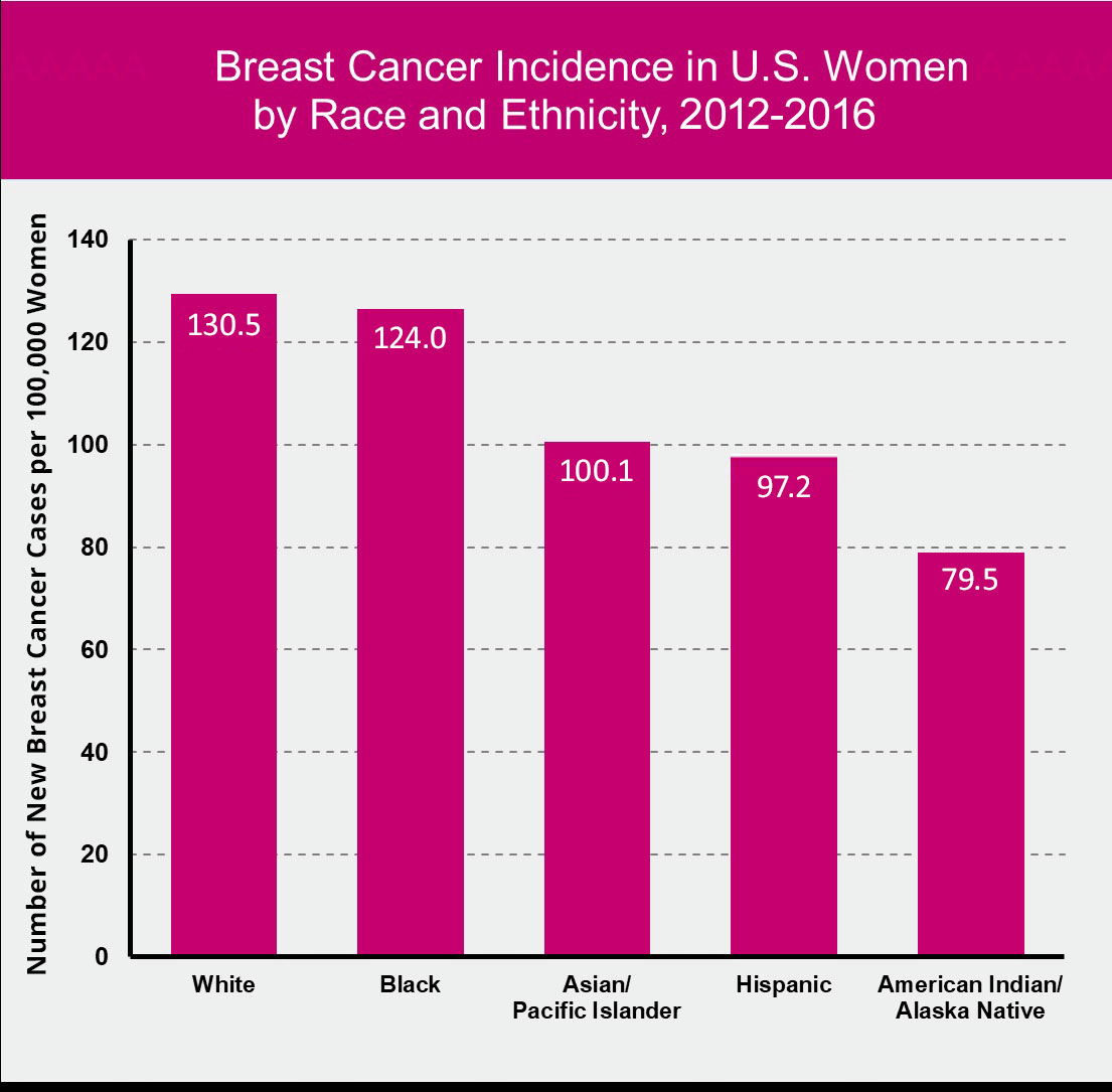
Susan G. Komen does have some data on how breast cancer disproportionately affects women of different races.
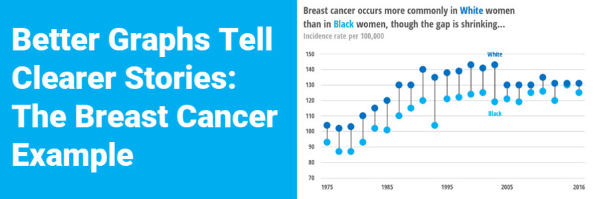
If you dig deep enough into the data section of their website, you’ll be able to find data on how breast cancer rates breakdown over time – and there’s a profound story in here, particularly if we could figure out how to present it better. Can you see the story?
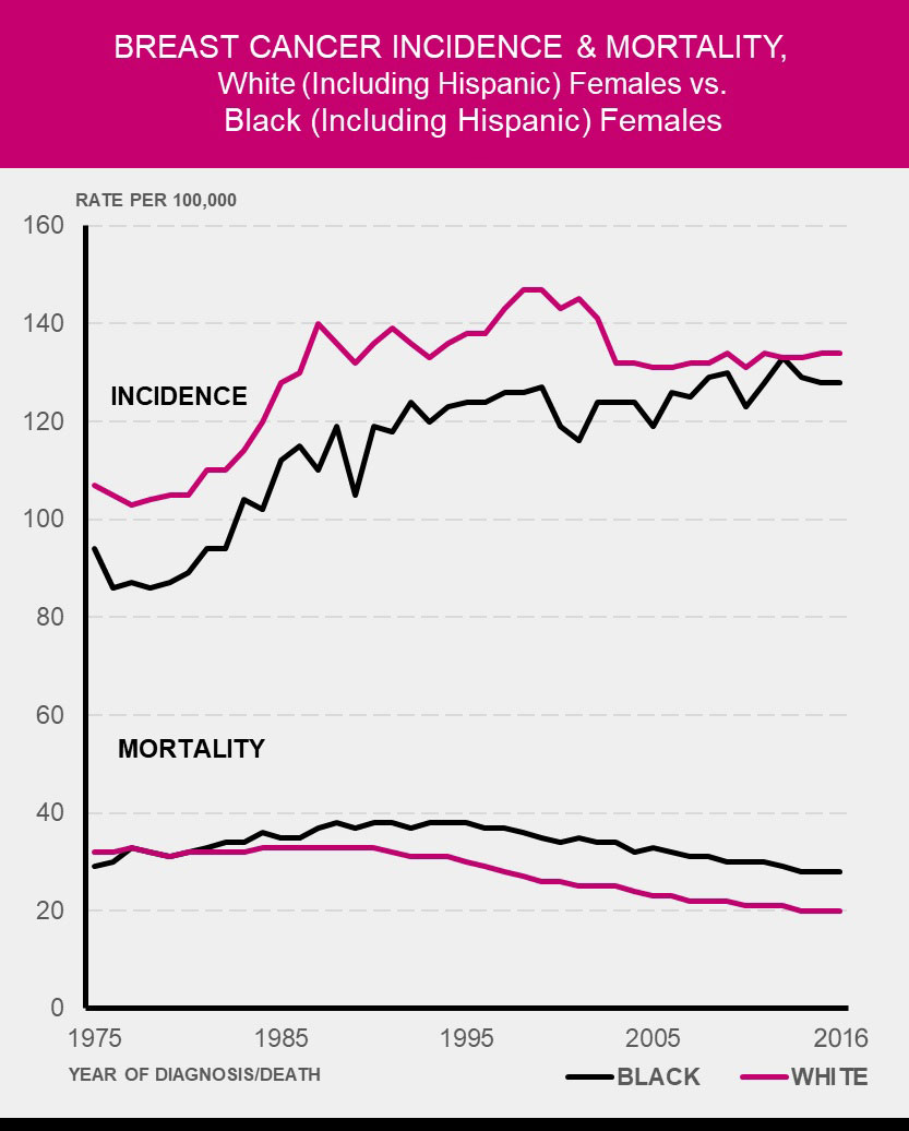
Let me spell it out: This graph is showing that, while white women have a higher incidence of breast cancer than black women, black women are more likely to die from the disease.
Now that I say that, can you see it in the Komen graph? It is easier, right? And that’s why strong, courageous, clear titles are important. But that’s not all. A better graph type on the same data would paint a picture that better matches this urgent, important story.

An overlapping bar chart is a more straightforward way of graphing data when the two variables are inherently interrelated, like incidence and mortality. This better captures the relationship, showing that those who die from breast cancer are a subset of those who contract the disease in the first place. The larger set of blue bars in the graph for Black women is key here.
If we wanted to zoom in on the racial disparity angle of this story, we could take this even further. You see, with the overlapping bar chart, it is easy to spot the relationship between incidence and mortality rates for each race but it is not so easy to compare incidence rates between Black women and White women because (1) the data are in two separate graphs and (2) the scale stretches all the way down to zero so as to include the mortality data. I mean, the gray bars don’t look all that different, do they?
Let’s reshuffle the data so incidence rates are paired together and mortality rates are paired together, using scales that are more appropriate for each set of data. And this time, let’s use a graph type that better tells stories about disparity – a dumbbell dot plot.

When we cram the data on the same scale, we make it difficult to see the important disparities in each data set. Adjusted scales, appropriate graph types, and clear titles (and – heaven help me – losing pink) create a set of visuals that tell the story about breast cancer disparity with the concern and urgency that are warranted.
We teach folks how to make smarter graphing choices in our Data Visualization Academy.
