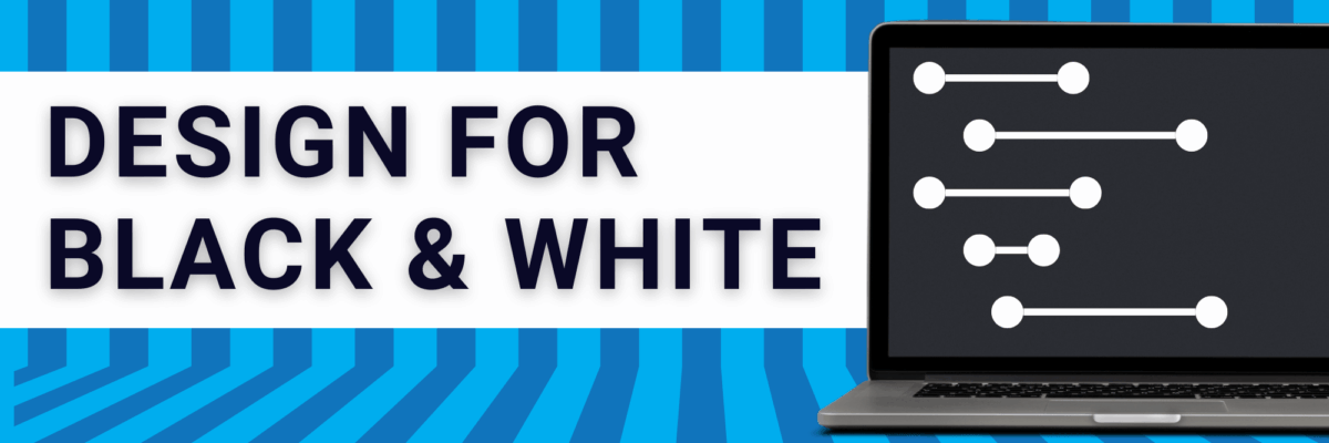
Stephanie’s Note: So so often I get emails from readers asking for examples of how full reports can incorporate more graphic design while still maintaining credibility and seriousness, especially for more conservative audiences. Sid’s report is a nice example of how well-considered images can boost engagement and appeal. Nice work,…
Reports
Embracing Data Visualization in Evaluation: A Management Perspective
Friends! I’m so happy to have Rakesh Mohan guest blogging for me. He is one helluva guy. He is the Director of the Office of Performance Evaluations, an independent agency of the Idaho State Legislature. In other words, his eval clients are lawmakers. You ask me for examples of reporting in…
Design for Federal Proposals (aka Design in a Black & White Environment)
I just finished a round of reviews for a major federal grant program and was, like every year, inspired to share guidance on how to design in such a restrictive environment. Issue: Federal grant programs tend to specify the page margins, typeface, and font size to make the amount of…
Evaluation Executive Summaries & Reports
Examples of great evaluation reports and executive summaries ranks as one of the top questions I get by email. What’s a good exec sum look like? How long should it be? How do I incorporate graphics into a report without looking like a marketing firm? Read on, friends. I’ve pulled…
Guest Post: 5 Tips for Creating Effective Visual Summaries for your Reports
Oh yeah – it’s my first ever guest post! I’m so happy to host Elissa – she does fantastic work. -Stephanie My name is Elissa Schloesser with Visual Voice, I’m a freelance graphic designer specializing in communicating complex information and ideas. I work specifically with mission-based organization, and partner…
What Business Cards Can Teach Us About Evaluation Reports
After 5+ years, which started as Michael Scriven’s assistant, I’m departing from The Evaluation Center at Western Michigan University on August 31 to accommodate the major increase in my consulting around data visualization and evaluation reporting. I began the tedious effort of cleaning out my drawers and came up the…
This is What Alignment Looks Like
Ideal alignment is when everything on a page or slide lines up with something else. This sounds pretty simple, right? But there are a lot of implications to consider. First, let’s examine a weak layout. I drew in some red lines, based on the start and end of…
What Bad Grouping Looks Like
Toy designers beware. Do not put your products into my little dude’s hands because I am an ex-teacher AND now I’m a professional evaluator AND I care about design. Look, just LOOK, at this deck of cards my son came home with. Notice the problem (aside from the…
I Can Make A Window in Plain English
I can make a window to discuss your parallel logistical innovation. Sound familiar? Didn’t some evaluation colleague say this at the conference this past year? Did *I* say this at the conference last year? Nope. It is a randomly generated bit of gobbledygook from…
Icon Construction
Icons or symbols are an “easy” way to organize information throughout an evaluation report. I say “easy,” but I really mean easy for the reader. Symbol sets provide mental organizational structure. They often aren’t so easy for the report author, though. Usually it can be difficult to find a set…