
Evaluation Executive Summaries & Reports
Examples of great evaluation reports and executive summaries ranks as one of the top questions I get by email. What’s a good exec sum look like? How long should it be? How do I incorporate graphics into a report without looking like a marketing firm? Read on, friends. I’ve pulled together some examples for you.
Note! None of these are perfect. Pick away at them as much as you’d like, Internet. But you asked me for some examples, so here you go. Get inspired.

Here is a one-page executive summary, almost dashboard-like, from Greg Gauss at the Battle Creek Community Foundation. He said they struggled to put something like this together internally and had the help of their parent network in actually making the document. Just guessing here, but I think it could be done in Publisher, with the help of Excel and some icons from the web.
What I like about this is the color blocking to mark off the four main areas they need to report on. I like the somewhat undistracting sun logo repeated in the background of different sections. That gives it a feel of activity and movement (good, especially when reporting on the year’s happenings!). I dig the arrow icons near the top that don’t just report data but give a sense of whether this is good or bad.
 Martina Bennett from MercyCorps sent me some of these examples, when I told her I didn’t really have many I could point to, from the Schultz Center for Teaching and Leadership. They publish both Evaluation Briefs (2 pagers) and Executive Summaries (3-5 pages). I pulled out my favorite from that bunch. What I like most about this one is the color – in the pics across the top, the text along the left, and the diagram in the middle. Like others mentioned in this post, I’d love to get my hands on the dataviz on the second page and tweak it, but otherwise, its succinct, structured, and appealing.
 Martina sent me this example from Oxfam, too. What I love about it is that the first page, shown here, makes me want to continue reading. The interior pages are actually nearly graphic-free, which may seem odd BUT it means the whole exec sum is can stay fairly short – just 5 pages in total. You could read it on a coffee break easily and walk away with a clear idea of the main points.
Don’t forget to check out the awesome visual summary of an evaluation report that Elissa Schlosser guest posted about a little while ago.
And now for a few well-done full evaluation reports:
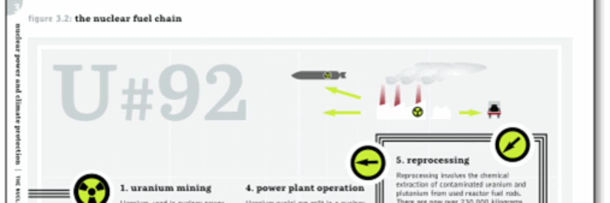
 My go-to awesome eval report examples are always those of Greenpeace. Regardless of your political alignment with them, they make damn fine reports. I talked with them in preparation for my book, where a report of theirs will appear, and I can assure you that they contract with a graphic designer to make their work shine like this. Even if you can’t do the same, what aspects of their work can you modify for your own report?
Aside from awesome information design graphics like the one on the page shown here, the rest of their reports are always clearly structured, highly graphic, on an excellent grid, and really engaging.
So not evaluation, per se, but tons of research with definite values being expressed, so pretty close you nit-picky Internet.
 Martina sent me this New Pathways to Resilience: Interactive report on CCAA program.
And it is cool! The report itself is laid out well, so that, while lengthy, it has navigational buttons at the top of each page to its easy to skip around to a section of interest.
The interior pages have tons of white space and big noticeable headers that also help navigation. They embedded videos and other graphics. Again, not perfect (*cough* graphs! *cough*) but I’d love to see more evaluation reports approach this level of images and navigation.

Do you know how awesome Innovation Network is? Those peeps produce an annual State of Evaluation report on eval activities in foundations and nonprofits. So part eval and part research on eval. And, by far, the most dataviz-based report I’ve seen produced. I know they worked with a graphic designer on the layout but they – the evaluators – had to know what types of graphs should be shown for which kinds of data and they needed to direct the designer about things like size ratios of the graphs so they didn’t distort the data. You might choose different visualizations for the same data if you were reporting on it, but you have to admit, it’s clean, easy, and information-packed.
At a recent keynote for the Visitor Studies Association annual meeting, an audience member asked me, “What should you do if you have an executive summary with no pictures or graphics in it?” My answer: “Add some.” Now here are some examples for your inspiration.
