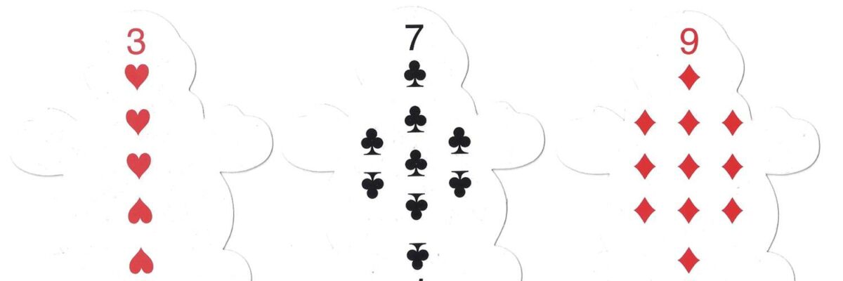
Toy designers beware. Do not put your products into my little dude’s hands because I am an ex-teacher AND now I’m a professional evaluator AND I care about design. Look, just LOOK, at this deck of cards my son came home with. Notice the problem (aside from the fact they are shaped like snowmen)?

The issue, you noticed, is that the category markers (symbol and number) are too close and too similar to the actual counting symbols placed in the middle of the card.
Here’s the corresponding lesson for evaluation report authors: when we use headers to signal an organization to a report, make the header really really really clearly different from the narrative text. When working with headers, we can use font, color, and other emphasis techniques to make the headers clearly distinguished from the text.
Now, with these playing cards, they may not be able to change the color – but there are other options. The category markers could be much smaller. Or much larger. Or positioned further away from the counting symbols in the middle. The counting symbols in the middle could also be squished closer together. In other words, there could be better grouping of elements (graphic designer Timothy Samara calls this technique “squish and separate” in his awesome book Design Elements: A Graphic Style Manual).
PS. The blogging schedule will cut in half to twice per month – I’ve got a book to put out! Sage has contracted with me to write a book on evaluation reporting, scheduled to be released in Spring 2014.
