
What Business Cards Can Teach Us About Evaluation Reports
After 5+ years, which started as Michael Scriven’s assistant, I’m departing from The Evaluation Center at Western Michigan University on August 31 to accommodate the major increase in my consulting around data visualization and evaluation reporting. I began the tedious effort of cleaning out my drawers and came up the ubiquitous stack of business cards I’ve accumulated over the years (why do we do that?). I saved a few because they reminded me of great graphic design principles that we should all be applying to our evaluation reporting.
Alignment
The best business cards (and evaluation reports or slides) look organized. Notice how well the Lansing Community College one is aligned:

Mary’s name and everything underneath it are all in line. You’d think this could be common but it’s actually pretty rare. Doesn’t it just look and feel professional and organized? (Admittedly, though, I do want to nudge up the LCC logo so it is top-aligned with her address.)
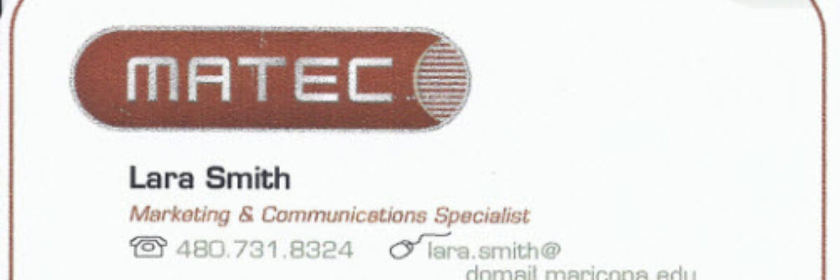
In this one, from MATEC, note how Lara’s name and info align under MATEC, even though the company name is stylized as part of their logo:

Strong alignment between text, headers, and graphics communicates professional competency. Work it!
Hierarchy
The most important thing on a business card is the name of the employee. Yet on most business cards, the employee’s name is small, put in the corner, and camouflaged by less important location information (let’s psychoanalyze what that means about employer-employee relationships). Great business cards showcase the employee’s name. Think about how this supports user cognition: If you’re anything like me, you’ve forgotten someone’s name within 10 seconds of introduction. We inevitably trade business cards before departing. I want to call this person by her name when we say goodbye, so I sneak a glance at the card. In the best case, the name leaps out and saves my day. Good design supports the needs of the end user.
Here is the nice emphasis carried out by Indiana State University:

See how Gerald’s name has been visually made the most important part of the card by it’s large size, color, and italics? In the hierarchy of importance on the card, Gerald’s name is at the top and the information of lesser importance is deemphasized. Mary’s card, way above, also achieves in establishing a hierarchy by making Mary’s name darker than the rest of the text and placed at the top of the card.
Our evaluation reports and slides should strive for the same communicative power. That which is most important should be set off in some ways, through color or placement or size or what have you.
Orientation
Orientation is actually one of those aforementioned emphasis techniques that can help establish a hierarchy on certain bits of text, but layout orientation of an entire business card is also a really powerful way to communicate unique, fresh, youthful, everything you are. Check out how New Latino Visions used orientation:
 The difference is eye-catching and eyeballs-on-cards is an important step leading to the goals of fingers-on-keyboard and name-in-memory.
Now, changing the traditional orientation of a report page or a slide would actually be fairly disruptive in that it would both distract and impair legibility. But the same idea can be applied to a picture or short bits of text like a heading to grab attention.
Our evaluation reporting tools are our business cards. Represent yourself well.
