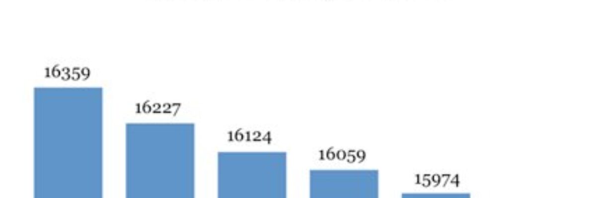
No, not the fountain of youth. The font of truth. Wait, could there actually be a font that communicates truth? This little experiment explains that, yeah dudes, that might be the case. Back in July, Errol Morris conducted an experiment. He wrote, as usual, a column for the New York…
What Business Cards Can Teach Us About Evaluation Reports
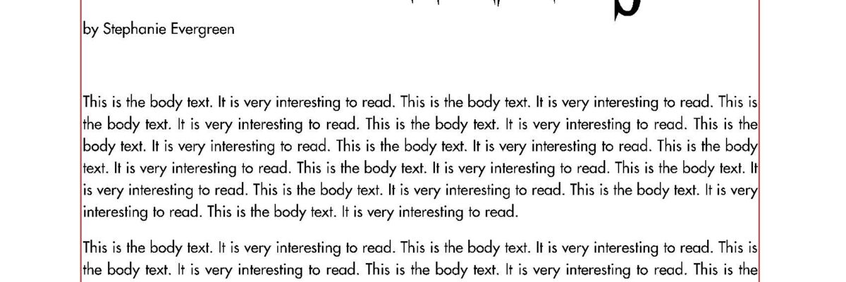
After 5+ years, which started as Michael Scriven’s assistant, I’m departing from The Evaluation Center at Western Michigan University on August 31 to accommodate the major increase in my consulting around data visualization and evaluation reporting. I began the tedious effort of cleaning out my drawers and came up the…
This is What Alignment Looks Like
Ideal alignment is when everything on a page or slide lines up with something else. This sounds pretty simple, right? But there are a lot of implications to consider. First, let’s examine a weak layout. I drew in some red lines, based on the start and end of…
Bleeding your Presentation
It’s time to talk about bleeding. Bleeding is a technique used by graphic designers in which the image extends all the way to (or even beyond) the edges of a page or slide. In the slide below, the image is not bleeding. The picture of the tractor is…
When Not to Use Data Driven Decision Making
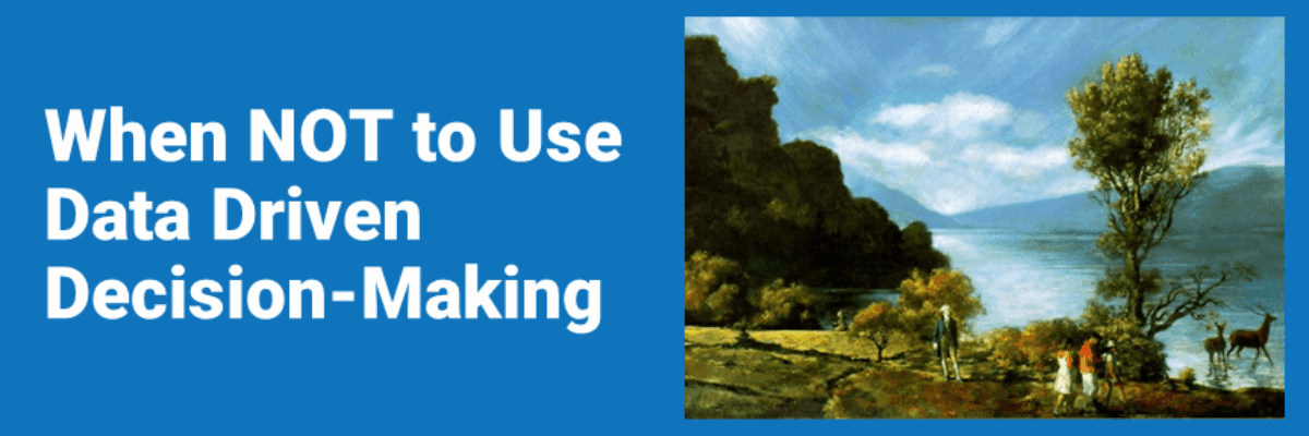
In 1993 two artists set out to make a data-driven painting. I’m not kidding. They contracted with a well respected research firm, ran a call center in the midwest, and used telephone interviews to gather opinions about the type of artistic content and composition people preferred. The poll used a…
Solving Font Substitutions
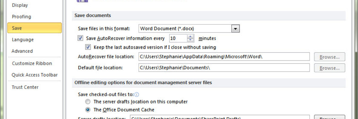
Ever start your eval presentation, peek behind you at the screen, and notice it doesn’t look anything like what you designed back in your office? Or open a report from an email attachment and wonder how your colleague PDFd it looking that way? The issue is typically due…
Why I’m Not In Love with Prezi
It’s time to write this post. This may be the most frequently asked question in my workshops on evaluation reporting, data visualization, and graphic design. What do I think about Prezi? Most people’s first reaction to being in the audience of a Prezi presentation is “Wow, that…
Beer Delivery Visualization
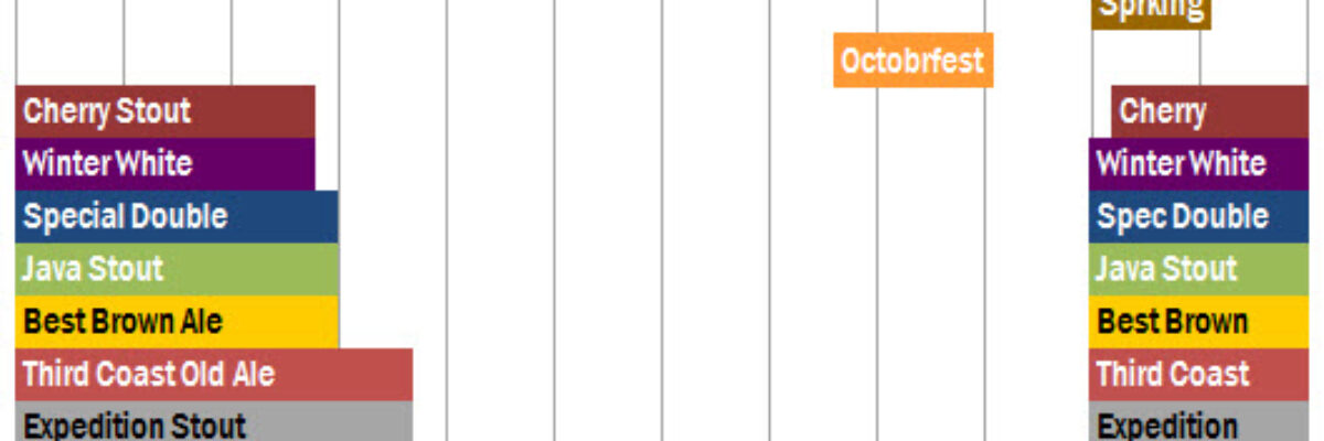
Time to tackle some of the more important parts of life. I saw this delivery schedule in a cooler at a DC Whole Foods. Bell’s Beer is from Kalamazoo and we take pretty big pride in our hometown beer. So we (I mean, I) get really geeked when…
Image Searching Made Easy(er)
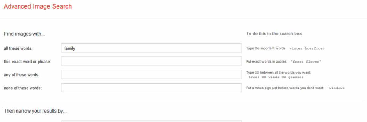
We all love to see large engaging images in evaluation reporting, but it sure can be a pain in the butt to be the one behind the computer monitor, scrolling through pages of images in search for the right one. Typically, this process takes weeding through a lot of eye-strain…
City Branding: Miami
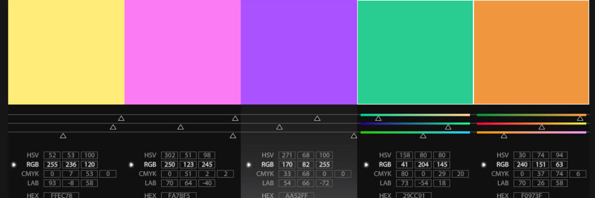
A few weeks ago I was letting the sunshine in Miami love me (well, it was mutual) when my partner commented that Miami really has it’s own color scheme and font, beyond it’s famed art deco architecture. It’s always been a touch puzzling to me when designer people talk about expressing…

