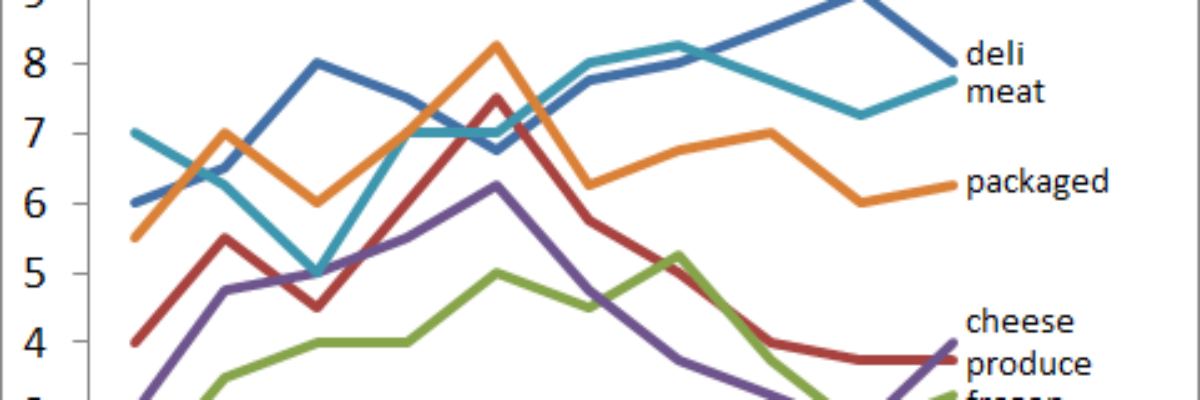
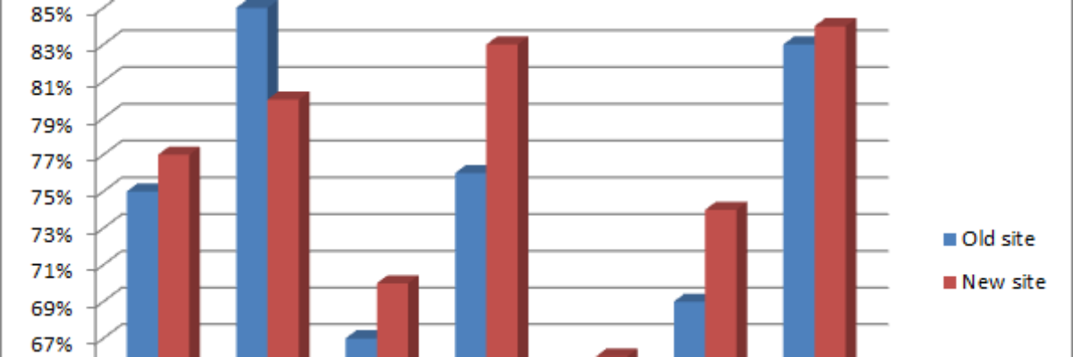
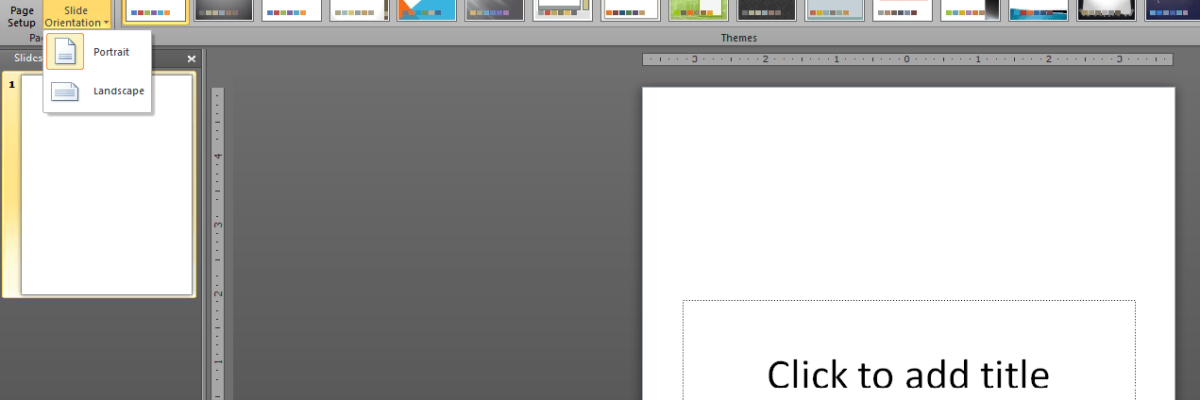
Delightful, strategy-shifting, and totally free ideas for your next data viz

What Exactly is Happening in this 3D Chart?

When giving advice about chart styles, one of my friends likes to say “save 3D for the movies.” She’s right – research shows that 3D charts actually slow reader comprehension. I’ve long advocated for the use of ChartTamer as a friendly way to restrict data visualization to that which will…

Read More

Worst Font Contest

Two years ago I ran this tiny contest on my social networking platforms for the worst font ever. Far and away, Comic Sans was the winner. Here are the others that deserved mention, along with the messages they tend to communicate: Jokerman: Also says “Fajitas Tonite!” (spelled with…

Read More

Kuler/Color

Here’s a procedure I use all the time to help me select color combinations for my reporting. It makes use of this great, free, online program that takes all the scientific color theory stuff and translates it for those of us without a MFA. First, I head to my client’s…

Read More

On the Struggle of Locating High-Quality Images

I’ve been pretty vocal about the need for greater use of images in our evaluation communications. And while I can get most people to vow to halt the use of clip art, finding high-quality images can be a total pain. What’s at our fingertips (i.e., available on Google Images) is…

Read More

Atomic Slide Development

Seth Godin recently published a blog post on the atomic method of creating slides. He put into words what many of us have felt about the overuse of bullet points. But more than talk about it, he detailed a method for actually moving from a typically bullet-pointed slidedeck to…

Read More

Communicating with Icons

If research gives just the facts, evaluation is distinct in that it often has an extra layer of interpretation and communication. We don’t just tell people 63.8% of students passed the class, we say “so what?” and interpret whether that 63.8% is good, worse, or whatnot.

Read More

Report Layout in PowerPoint?

I was recently workshopping with a group of evaluators who had bravely submitted their work examples for group critique. In one instance, they had admitted that what I thought were text-heavy slides was actually a full written report. That’s right – they’d used PowerPoint for written report layout. Mind. Blown.

Read More

Releasing the Evaluation Report Layout Checklist

So I made this lovely checklist of graphic design best practices as a product of my dissertation (Standing Rule: If you want to know the details of my dissertation, you’ll have to buy me a drink). It included input from a panel of graphic designers including Peter Brakeman,…

Read More

The Year of Data Visualization and Reporting

On the plane, heading back from the American Evaluation Association’s annual conference in Anaheim. Long plane rides such a great opportunity for reflection. What’s on my mind? The overwhelming success of the Data Visualization and Reporting Topical Interest Group. We had so much support in getting this group launched…

Read More