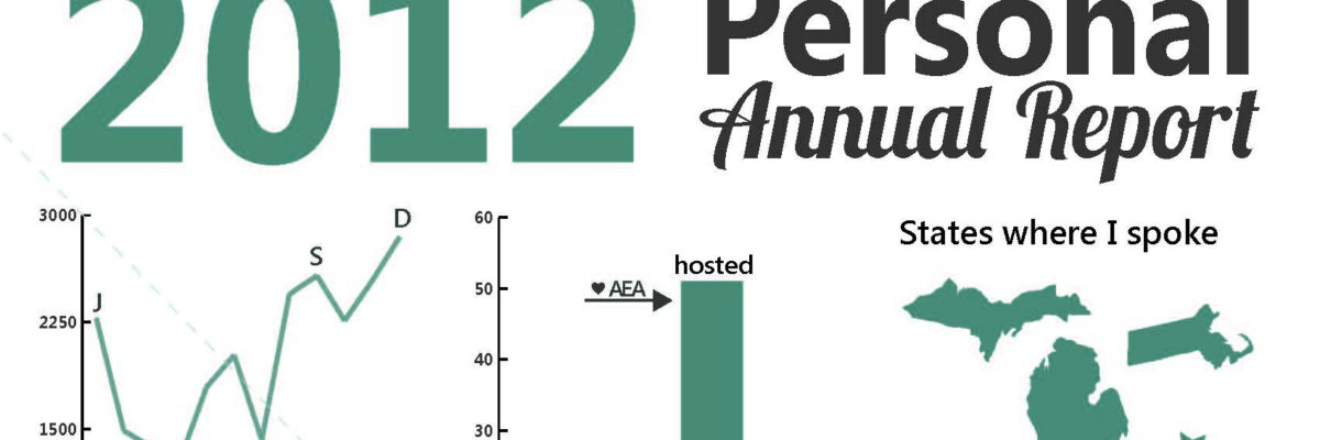
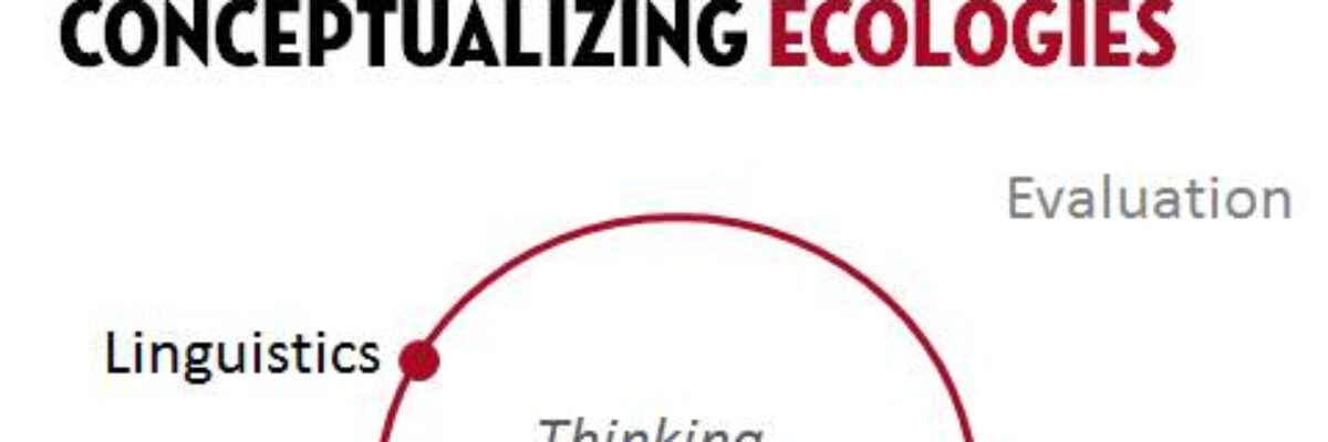
Delightful, strategy-shifting, and totally free ideas for your next data viz

My 2012 Personal Annual Report

Yeah – It’s that time of year again! Here’s what I’ve been up to. Imagine if we could convince more clients to let us produce evaluation report summaries in this dashboard-esque format. Side note: I deviated from my normal routine and made this report…

Read More

Before & After Slides: Stay on the Side of Simplicity

My friend, Kurt Wilson, and I just wrapped up a contract to revise a set of slides – and the graphs within – for a big international client I can’t name. Here I’ll walk through one of the original slides and our revision of it. Keep in mind that these…

Read More

Making Back-to-Back Graphs in Excel

Let’s say we’re interested in comparing how two groups – oh, teachers and principals – responded to a survey. One way to visually display that comparison would be a bar graph, where each question had two bars, one for teachers and one for principals. It’s helpful in some ways, but…

Read More

How I Feel About Slide Animations

Most people fall into one of two camps on this issue: There are the newbies, who use animation with abandon to kartwheel text onto a slide. And then there are the veterans, who are so sick of kartwheeling they’ve rejected any slide animation on any computer anywhere in the…

Read More

A Review of Presentation Platforms

PowerPoint tends to get a bad rap. You know, that whole “death by PowerPoint” thing. It probably isn’t what the marketing people at Microsoft are most fond of. But weak PowerPoints have much more to do with the user than with the platform. But what about alternatives – total breaks –…

Read More

Bonus Post: Online Data Visualization and Reporting Classes

I’m taking my normal in-person speaking engagements online and you can come. I’ll be presenting one 90-minute class per month and repeating this entire series every 4 months. You’ll even get a sneak peek of examples from my forthcoming book (don’t tell Sage). Here is the lineup: Reporting to be…

Read More

Bonus Post: Picture “Evaluation in Complex Ecologies”

This year, the American Evaluation Association is loaded with a ton of great stuff. I’ll be speaking on the Potent Presentations Initiative and what makes great messaging, design, and delivery. I’m also really excited to see the closing session on Saturday, because AEA President Rodney Hopson is pulling together…

Read More

City Branding: Chicago

Earlier this summer we hitched a ride on the train to Chicago for a few days to enjoy that beautiful city before it turns blustery and cold for 6 months. As usual when traveling, walking around the city made me think of how it…

Read More

More Images: The Dissertation Breakdown

At this time last year I was putting the final touches on my dissertation manuscript format and preparing for my defense. I looked at the extent of graphic design use in evaluation reports. I gathered about 200 summative evaluation reports from the repository at Informal Science Education, trained…

Read More

Assigning a Color System for Graphs

Let’s give the audience a peek behind our mental curtain. We want to make our logical organization of our data very very clear because what makes sense to us (who have been so steeped in the data we’re dreaming about it) will not be readily obvious to an outside viewer…

Read More