
City Branding: Miami
A few weeks ago I was letting the sunshine in Miami love me (well, it was mutual) when my partner commented that Miami really has it’s own color scheme and font, beyond it’s famed art deco architecture. It’s always been a touch puzzling to me when designer people talk about expressing personality of something through elements like typeface, color, and other design elements. But in Miami, this was crystal clear.
Below is the sign for a mall near the Coral Gables neighborhood. Granted, it is a new mall, but the sign designers skillfully tapped into the flavor of Miami.

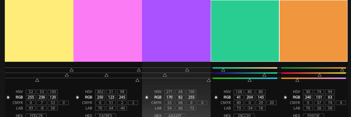
Notice the slim retro font. That’s Miami. Notice the color-based three dimensions. That’s Miami. Notice the colors! So very Miami. In fact, it inspired me to develop a Miami color scheme, using Adobe Kuler:

The Adobe Kuler program is pretty easy to work with. I’ve used it before to pull colors from an image. In this case, with just my sun-filled memories, I simply moved the markers on the color wheel and adjusted the sliderules under each color square until I felt like I was back on A1A, beachfront avenue. I can see going through the same procedure to develop a color scheme based on a classroom observation, a rural site visit, or set of interviews with inmates. How could you represent the flavor of your evaluation project?
