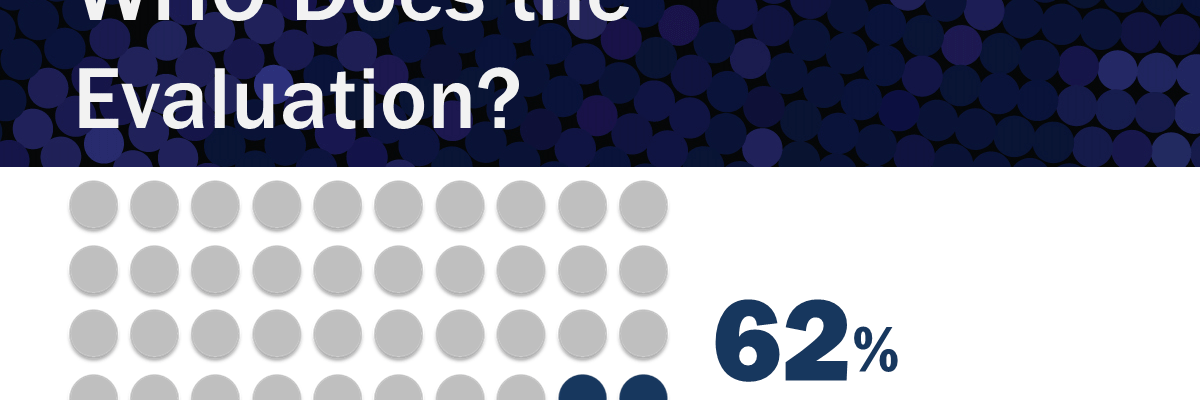
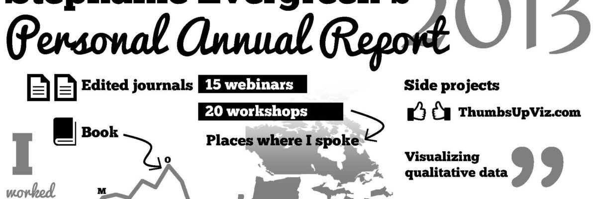
Delightful, strategy-shifting, and totally free ideas for your next data viz

Organize your Reporting with a Style Sheet Template

Dudes, I know report writing is no small task. It takes lots of people working on different parts – sure. But so often I see reports that look like they’ve been Frankensteined: different fonts and colors in each section, barely stitched together into a cohesive whole. One way graphic designers…

Read More

Finding Fonts & Passing Them On

Sometimes (okay, lots of times) you may find that you need something beyond the default fonts loaded onto your computer. None of these. But other solid, free for commercial use fonts can add the right flavor to your evaluation reports and presentations. My favorite places to…

Read More

Rule of Thirds Template for Slide Layout

While it’s best to sketch a few ideas before you even hit the power button on your computer, once you do open your slideshow software, head first to the slide master and rearrange the default slide layouts into something more attention-grabbing. Try using the Rule of Thirds. The Rule…

Read More

How to Make a Diverging Stacked Bar Chart in Excel

Last week my friend Ann Emery posted a dataviz challenge on something I’d been wanting to figure out for a long time: how to make a diverging stacked bar chart in Excel (I’d also heard of them as sliding bar charts, but getting our dataviz terminology on the same…

Read More

Evaluation Executive Summaries & Reports

Examples of great evaluation reports and executive summaries ranks as one of the top questions I get by email. What’s a good exec sum look like? How long should it be? How do I incorporate graphics into a report without looking like a marketing firm? Read on, friends. I’ve pulled…

Read More

Lessons from a 4th Grader’s PowerPoint

A son of friends, we’ll call him Avery, was tasked with every 4th grader’s nightmare – prepare and deliver a presentation on one of the US states. When I was in 4th grade, we didn’t have PowerPoint or wikipedia. I think I made a poster that includes pictures clipped from…

Read More

Dashboard Icons in Excel

We don’t just report the facts, ma’am. We use a set of values to make judgments about the data, like which of these results is good or needs improvement, etc. We set benchmarks and cut points so our clients can understand when action needs to be taken and where. Yet…

Read More

How to Effectively Present Quotes

When it comes to qualitative data, we have far fewer dataviz tools at our disposal. Another time, promise, we’ll get into word clouds and what Stuart Henderson thinks of them. Today, let’s tackle a more common method of displaying qualitative data – quotes. In reports, quotes are usually shown…

Read More

Evaluation Swag

Conference season has begun (does it ever really end?) and I’m thinking again about the swag. You know, those freebies given away by vendors or fellow evaluators. I am personally not usually excited about the heaps of easily breakable plastic crap, but if done well evaluation swag can make a…

Read More