
When Not to Use Data Driven Decision Making
In 1993 two artists set out to make a data-driven painting. I’m not kidding. They contracted with a well respected research firm, ran a call center in the midwest, and used telephone interviews to gather opinions about the type of artistic content and composition people preferred.
The poll used a stratified (by state) random sample to snag 1,001 responses, which had nearly perfect distributions in terms of income, gender, race, education, and political beliefs. Researchers would be hard pressed to obtain the same representativeness in most of our work.
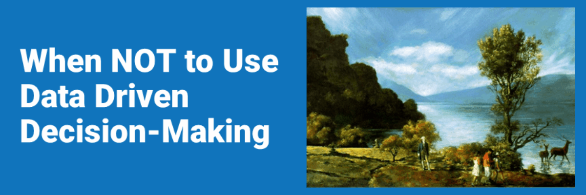
The artists calculated simple descriptive statistics and used the analysis to create a painting which reflected the desired artwork of the majority. The result is the painting below, America’s Most Wanted. Imagine it dishwasher-sized. And yes, that’s George Washington and a random group of anonymous people in the picture.

The artists debuted the painting in Soho, published it in magazines and paraded it around the country in town hall meetings. The main sense of those in the crowd, upon digesting their data-driven art, was… embarrassment. The painting was quaint. Provincial. Even ugly. One of the artists, Komar, said, “It is my hope that people who come to see our Most Wanted paintings will become so horrified that their tastes will gradually change, and another poll would gather different results for creation of paintings that do not resemble blue landscapes.”
Now this poll was examining tastes, but the same problem occurs all over the place when we have the good intention to making data-driven decisions. Henry Ford said, “If I had asked people what they wanted, they would have said faster horses.”
It isn’t as simple as asking people what they need. Some researchers have wised up to this idea, so they observe behavior instead and surmise needs from their observations. But what would the artists have observed in this study? About 50 percent of the respondents said they visited an art museum never or less than once per year. Not much to observe. Sometimes the smartest decisions come from an innovator who knows the audience base well, not from the audience itself.
By the way, the painting below is a representation of all of the worst rated features, America’s Least Wanted.

The poll was replicated in several other countries around the globe, with nearly similar results. See the resulting paintings for other locations and explore the data at http://awp.diaart.org/km/
