I am a data nerd. I grew up, professionally speaking, designing studies, collecting data, and trying to get people to make use of the analysis and results. After I married a graphic designer, I realized that no one was going to pay attention to my amazing, glorious, wonderful data if my…
Blog
How To Teach People Data Visualization
Have you ever accidentally taken one step too far down the internet rabbit hole? This has happened to me more than once when I’m trying to google the solution to why my chart isn’t working. I click into a Q & A forum that teases the answer – but the…
The Answer Lies Within
The most annoying Magic 8 ball answer would be “The answer lies within.” Because, it’s like, why would I even be consulting you, Magic 8 ball, if I already knew the answer? Yet in reality I can’t even believe how often this is the case. People will actually tell me…
Will Amazon Lift Their Ban on PowerPoint?
When Jeff Bezos said in his 2018 annual letter to stakeholders, “We don’t do PowerPoint,” you could almost hear the stock price of Microsoft sliding downward. Presentation designers around the world started looking for second jobs. CEOs in other organizations started to follow suit, because whatever Bezos does is…
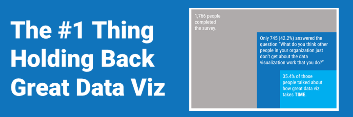
The Number One Thing Holding Back Great Data Visualization
Once a season I’ll get an itch to overhaul some part of my house. It’s an old house, so it usually happens that in the process of fixing one problem, we identify another that will send me back to my local hardware store and double the length of the project.
Title Charts Like A Journalist
When you spend the bulk of young adulthood in research-focused academic institutions, like I did, you are steeped in a culture that tells you, explicitly or implicitly, that you can’t ever really make a claim. Taking a position on something can be seen as biased. Claiming an insight can be…
Make Great Graphs in Google Sheets
If you’ve ever been in the audience of one of my workshops, you can tell that I was once a teacher. I use the same classroom management skills when I teach 100 adults how to graph as I did when I was teaching 25 kindergartners how to read. Back…
2021 Evergreen Mentoring Program
Life and death situations cause us to rethink our priorities and the pandemic has been no exception. I have seen so many of you come to the conclusion that you want more control over your day-to-day experiences and you are ready to take that tiny side hustle and turn it…
Proportion Plots
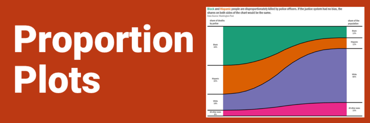
Proportion plots help us compare the share of a population between two metrics. It uses length on the left and right side of the chart and connects the lengths by a band in the middle that swoops a lot if there is disproportionality and stays pretty even if the proportions…
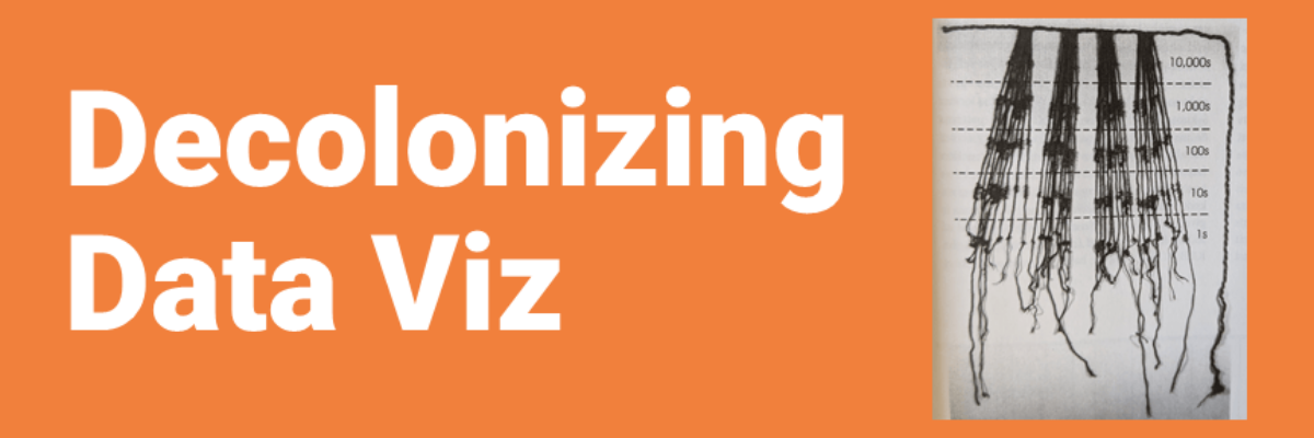
Decolonizing Data Viz
What is Data Visualization? A visual representation ofquantitative or qualitative data. so says Stephanie Evergreen. The strength of this definition is that it is so broad, lots of things fit under its umbrella. But perhaps that is also its weakness because it leaves what counts as data open to interpretation…
