Once a season I’ll get an itch to overhaul some part of my house. It’s an old house, so it usually happens that in the process of fixing one problem, we identify another that will send me back to my local hardware store and double the length of the project.
As we hauled the paint cans into the bedroom to start the repaint, I spotted pits and bumps in the wall that my perfectionism couldn’t ignore. We needed to patch and sand before we could prime. The project that should have taken a day ended up taking three.
Now, I coulda easily just slapped some paint on that uneven wall and passed the real fix on to the next homeowner. But when you are invested in the quality of the outcome, you don’t cut corners. Instead, you start anticipating that every project will take twice as long as expected.
If you ask your boss if she relates to my story, she’ll probably say yes – so many of us have been to the hardware store multiple times in one weekend.
What many bosses don’t see is that great data visualization is a lot like a small home reno project.
*IF* you care about a quality outcome, you know you gotta attend to whatever is akin to those dents and bumps that need patched and sanded. You’ll wrestle with the cleanliness of the data, the data structure, the incompatibility with your data viz tools, an error in the code, and the list goes on. Am I right?
Most data visualizers have been around the block enough to know that Hiccups Happen (trademarking this). You are wise enough to recognize that the project will take twice as long as expected. It’s just that your boss doesn’t get it yet.
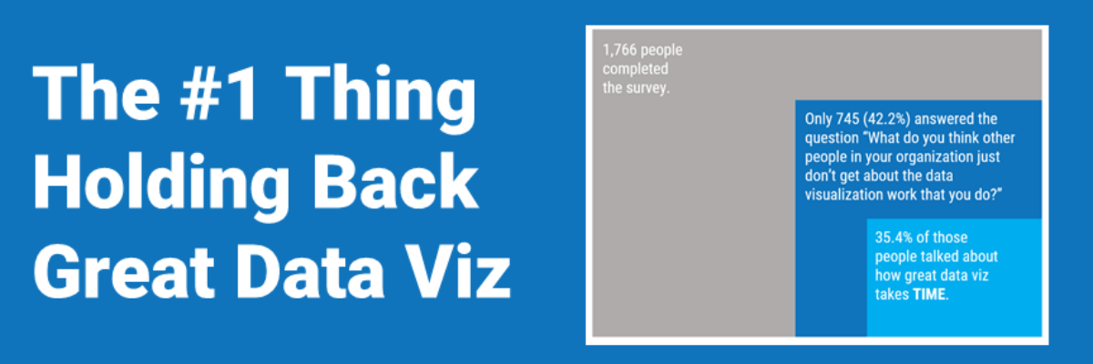
In fact, a survey of 1,766 data visualizers who attended the Outlier Conference held by The Data Visualization Society said exactly this. They were asked “What do you think other people in your organization just don’t get about the data visualization work that you do?” The most common answer, by far, among those who responded to this question, focused on TIME.

Out of the 745 people total respondents, over a third talked about time constraints as the biggest thing they wish other people understood. This was an open-ended question, so the responses were full of gems that articulate this issue so well.
Wise data visualizers read that quote and nod their heads in agreement. Trust us, you want those errors corrected.
Survey respondents are obviously dealing with totally different scopes of work, but I saw off-the-cuff time estimates range from the above-mentioned 10 hours to *weeks* of work, either of which will probably blow your coworker’s mind.
The good news is that the overwhelming discussion of TIME means you are not alone in feeling like you are set up with some unrealistic expectation.
The tougher news is that it sounds like we have to start training our colleagues to anticipate a lengthier lead time.
I love how this survey respondent pointed out that our colleagues might be misled because they think tech makes us more efficient.
But the tech will not know the data story and the best design format. Great data viz still requires skill, art, and human touch.
Perhaps strength in numbers can help us provide a gentle reality check to those we work with. Time is the number one thing holding back great data viz. You want an awesome dashboard? Don’t ask the night before.
PS. My faaaaaaaaavorite response in the survey was from someone who, like me, is clearly on a first name basis with the folks at their local hardware store.
