
Proportion Plots
Proportion plots help us compare the share of a population between two metrics. It uses length on the left and right side of the chart and connects the lengths by a band in the middle that swoops a lot if there is disproportionality and stays pretty even if the proportions are the same.
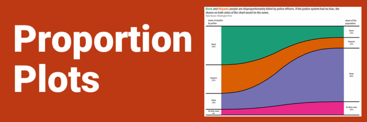
This is the kind of story we often need to tell when we are trying to talk about how our sample compares to the overall population. If your sample is representative, each side of your proportion plot would be equal. Often times, such as with my example below, this is not the case.

We have major disproportionality between the racial makeup of our overall population and the racial makeup of who is killed by police officers.
I made this graph in Excel after seeing the visual produced by Statistic.ly, shown here:

and I’m calling it a Proportion Plot. I can no longer find this image on their website, only on their Twitter account. I pulled my data from their same source, the Washington Post, and you can see how WP visualized this same data here. Here’s how another group visualized it. I think the Proportion Plot is the best.
My clients think so too. I mocked up data on their students in special education, compared to their student population overall and showed this to them in a Zoom meeting.

Responses were “Yes.” “YES!” and “YAAAAAAAAAAAS.”
In working with the development of this graph (rebuilt in Excel primarily by Joe Travers) and experimenting with different data sets, it became clear that when one racial group composes a large proportion of your population, it gets difficult to see how groups that compose a smaller proportion stack up. That can often lead analysts and designers to collapse some of the smaller numbers into one group that they call Other. And that can “other” people and contribute to exclusion. I asked around and learned that “Other races” or “All other races” were phrases that felt more comfortable to people usually clumped into that category, though they still aren’t perfect. Please keep this in mind when you are adapting this chart for your own data. Don’t be like CNN, who offended many indigenous people by using “something else.”
And yes, please adapt this chart for your own data. You can download my Excel file here. It’s a beast, I know. I included some basic instructions if you want to make your chart from scratch. You can also just work from my finished chart in the file. We’ll have step-by-step instructions (written and video) for this chart in my Data Visualization Academy soon – for Excel, Tableau, and R – including how to add or remove more categories. Stay tuned.
Meanwhile, as I watch the news report on yet another unarmed Black person killed by police, it seems to me that one of the many actions I can take is to release this file so that you can use it to tell clearer stories about disproportionality with the urgency those stories deserve.
Follow Up Q & A
I got some great questions about this graph, as one would expect when viewing a new chart type.
Q: Isn’t this just a Sankey diagram?
A: Nope, though they do look visually similar. Sankey diagrams depict flow. So categories on the left break apart and flow into subcategories on the right. A Proportion Plot is not about flow, it is about comparing the proportion of the same categories in two different settings. No subcategories involved. In a Sankey, flows can cross. That wouldn’t happen in a Proportion Plot. Here’s what data similar to Proportion Plot on deaths by police (this is completely fake – I just made these numbers up) would look like in a Sankey. I used SankeyMatic to make this.

Q: Isn’t this just made from a stacked area chart?
A: Yes, I hacked it from an area chart but it is not an area chart. Stacked area charts are typically used to show change over time and proportion plots do not.
Q: But I am reading this as an area chart, as though it is change over time.
A: Yeah, you might have to get out of your own way on this one. Big time data nerds (hey, that includes me) often get our minds fixed on certain ways to read charts and it can take a beat for us to open our minds up to something new. People who are not big time data nerds tend to have less of a problem. Try it! Other people already have given it a go and produced some awesome results. Check out Nick’s proportion plot:

Originally tweeted by NickVsPPT (@nickvsppt) on January 20, 2021.
and this one from Richard:

