
Will Amazon Lift Their Ban on PowerPoint?

When Jeff Bezos said in his 2018 annual letter to stakeholders, “We don’t do PowerPoint,” you could almost hear the stock price of Microsoft sliding downward.
Presentation designers around the world started looking for second jobs. CEOs in other organizations started to follow suit, because whatever Bezos does is gold. But nearly everyone who has ever sat through a corporate meeting was likely sighing with relief.
Let’s face it: Most PowerPoint presentations are painful to sit through. They tend to cause confusion and waste everyone’s time.
However, when a PowerPoint is done right, a good presentation can actually help organizations make bottom-line business decisions and get to market faster, unearthing good ideas and halting bad ones. So what Amazon got strategically wrong was that they blamed the tool — PowerPoint — when the issue was how they were using it.
In his letter, Bezos explained that instead of a PowerPoint presentation, everyone would silently read a six-page written memo at the start of the meeting.
But Bezos conceded that while some memos Amazon employees wrote have “the clarity of angels singing,” others “come in at the other end of the spectrum.”
Just like PowerPoints. The tool isn’t the issue.
Writing a clear memo isn’t necessarily easy, either, Bezos said. In fact, it may take a week or more, he said. And the same goes for a good PowerPoint presentation.
I’m hoping that the new CEO, Andy Jassey, can recognize that:
(Not that Amazon needs more money.)
So what makes a better PowerPoint presentation? It isn’t slapping some tables on a slide, which is what I usually see when consulting with corporations about their data communication culture.
This example about Amazon came from an article published in The Street using information from MWPVL International:
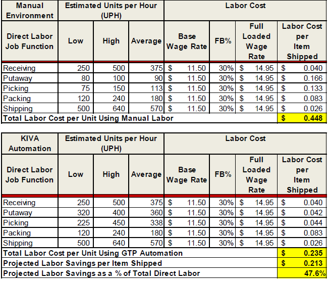
Tables are difficult to mentally process. It takes an incredible amount of cognitive energy to compare the numbers from different cells and paint a picture in one’s mind’s eye about the differences and magnitude of change.
This is how people end up spending half the meeting trying to sort out what they are looking at, which can delay critical decisions and squash healthy conversation.
Instead, to be better understood, the data in those tables need to be visualized as a graph. But graphing in an Excel-default style almost guarantees extra clutter and confusion.
Here’s another graphic The Street used that not only violates accessibility standards around red-green colorblindness, but it uses more labelling than necessary and doesn’t have a clear point.
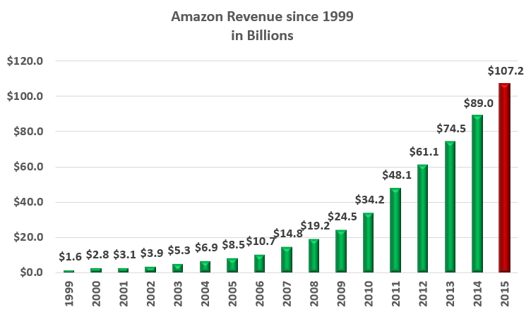
The lack of clarity is probably the largest contributor to unhelpful PowerPoint presentations and is the biggest reason as to why most people are glad to see them go.
People are on the lookout for the big idea. They are attending the presentation to learn the speaker’s insights, which need to be readily apparent. People are so tuned into trying to find the big idea, they’ll create one where one may not have been intended.
Your audience will look at a slide for about 3 seconds, asking “So What?” The answer needs to jump right out, before we waste precious meeting minutes stumbling to guess at the point. Here’s a clearer and more visually pleasing way to remake this slide:
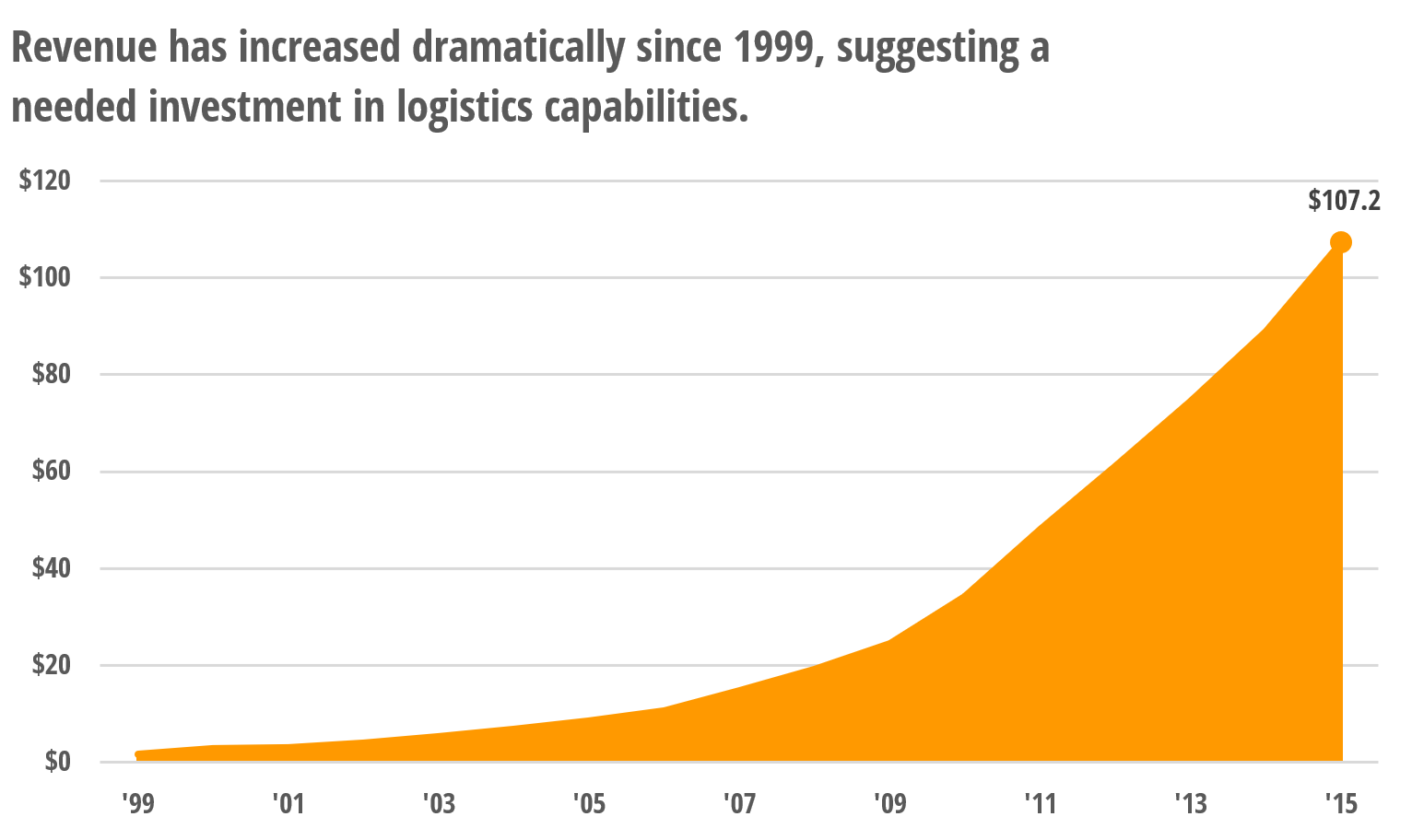
As I explain in Effective Data Visualization, high-impact data visualizations are the result of small but important tweaks.
Here are my four rules for making better PowerPoints.
- Say Your Point
I gave the whole visual a more insightful title – one that will focus the conversation in the meeting and get decisions made. - Pick the Right Chart Type
An area graph is a more appropriate chart type – one that better communicates a trend over time – than a column graph.
- Use Smart Colors
I used Amazon’s orange, rather than red and green and removed the silly beveling on the columns.
- Reduce Clutter & Add Emphasis
In the previous graph, I assumed there was a point to the color change for 2015, so I indicated it in a better way with a marker and a label. I removed the rest of the data labels from the graph and I took out every other year in the x-axis. I even changed to font to one a better, non-default one.
The original visual was probably made in less than 30 seconds by clicking on default buttons in PowerPoint.
Sure, it took me a few minutes longer to generate this improved example. But as Bezos said, high-quality presentations take time. The payoff for the investment of your time is decision-making that is clear and efficient, high-quality and fast. And that’s what Amazon is all about.
Don’t give up on PowerPoint. Just use it properly.
