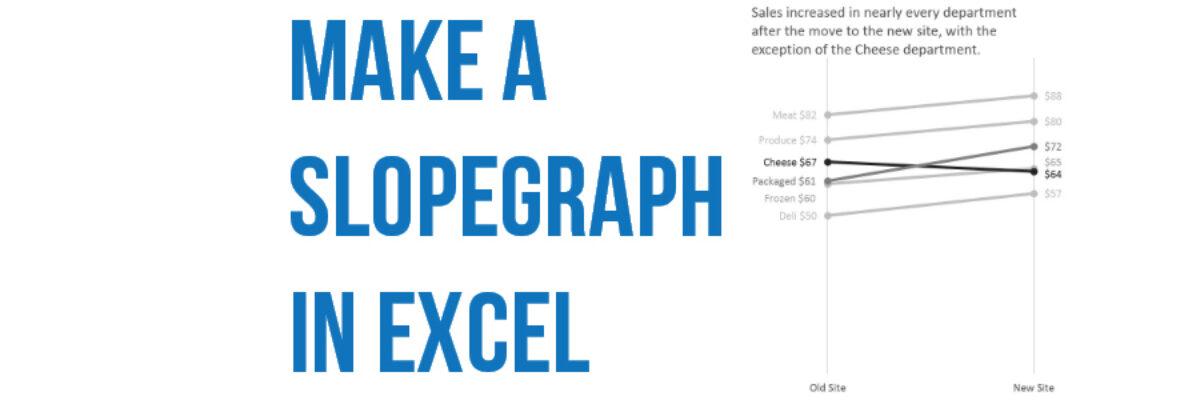
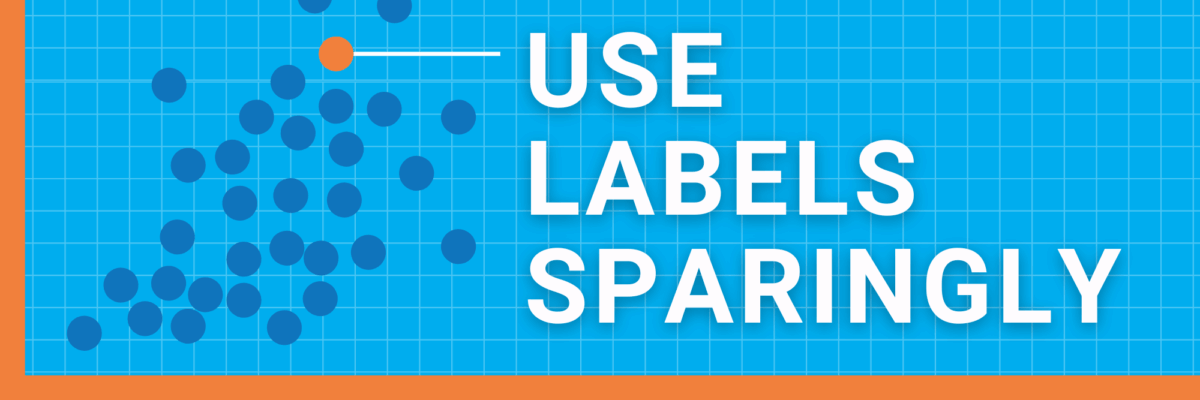
Three Ways to Show Down is Good

Humans in the western culture tend to see things that trend upward as positive and lines that trend downward as bad. But what if bad is good? And not like my college boyfriend. But in the sense that a decrease is a good thing. Let’s use the example of weight…

Read More

Make a Slopegraph in Excel

Slopegraphs are a newer graph type with powerhouse capabilities. They rely on Excel’s line graphing feature but they don’t necessarily have to show change over time. Slopegraphs play into our ability to judge slope fairly well. For this reason, they are perfect for highlighting the story of how just one…

Read More

I’m a Woman and I Need Data, Too

Dear Good Housekeeping, I needed a few new appliances. My old Shark vacuum cleaner bit the dust for the second time and in the same week my washing machine started eating all my towels. So I was interested in the spread from your Good Housekeeping Research Institute, reporting on its expert tests…

Read More

When I Don’t Mind Radar Graphs

Most of the time, I think radar graph are deployed wrong. They are designed to show percentages along several categories – like a bar graph could – but the axis are distributed around a central point, such that the percentages link together and create a shape. Choosing a radar graph,…

Read More

Visualizing Tiny Trends Over Time

I say: Trend over time? You say: Line graph! I know, that’s how it goes, right? We are so used to seeing trends over time visualized as line graphs that even my 3rd grader can interpret them with ease. But sometimes it helps to have other options that better fit your…

Read More

The Most Important Question in Data Visualization

What’s your point? Seriously, that’s the most important question to ask when creating a data visualization. And its the first thing I ask a client who sends me data for redesign. What’s your point? The answers drive nearly everything about visualizing that data. Here’s how that conversation often goes: Client:…

Read More

Visualize Branching Questions with Nested Area Graphs

This, my friends, is a nested area graph. I got this idea from the smart people at Innovation Network. And it is super amazing at visualizing the sequence of survey questions that branch. The kind where it says “if you said Yes, proceed to question 32” and stuff…

Read More

Data-Driven Decisions in a Fortune 500

More and more, organizations are on board with the idea of becoming “data-driven.” Collecting data on key indicators is a big step ahead from where many organizations used to be. But being able to interpret that data and share it with others in an intelligent way is equally as important…

Read More

How a Dashboard Changes the Conversation

Presenting data effectively changes the kinds of conversations that can happen inside organizations. Better presentations shape an improved culture of decision-making. Let me tell you about a recent example of this. Late 2012 I got a call from an evaluation officer who was working at the Walton Family…

Read More

Customizing Colors in Excel

Few things scream “I didn’t try very hard” more than using the Excel default color schemes. Good news is that changing them up isn’t really very hard at all. First, decide what other colors you would like. Maybe pick something from your organizational brand. I used ColorBrewer to come…

Read More