
Make a Slopegraph in Excel
Slopegraphs are a newer graph type with powerhouse capabilities. They rely on Excel’s line graphing feature but they don’t necessarily have to show change over time. Slopegraphs play into our ability to judge slope fairly well. For this reason, they are perfect for highlighting the story of how just one category decreased when others increased, or to show that one increased at a rate much faster than the others.
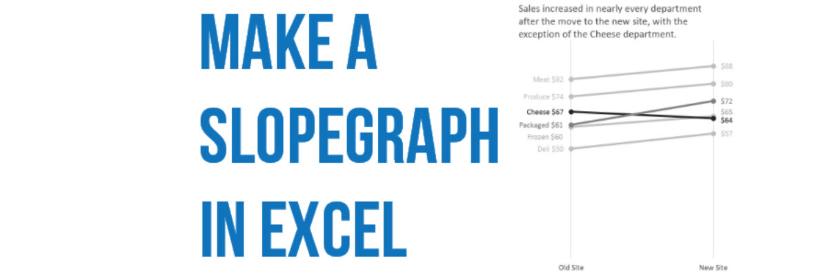
Let’s say we are comparing sales in each department of a grocery store, before and after they moved locations. As a side by side bar graph, it would look like this:

Even though humans are good at detecting length, this graph is somewhat difficult to digest. It’s a bit hard to see that sales of cheese are actually down at the new site, for example. It’s easy to miss that just one New Site bar is shorter than its corresponding Old Site bar. A slopegraph will make the story clear.
The table for a slopegraph is probably quite familiar: just two columns of numbers.

You will highlight the rows and columns and insert a line graph. I prefer a line graph with markers, but maybe I’m just obsessed with dots.

It doesn’t quite look right – the departments are on the x-axis and they shouldn’t be. Click your old friend Switch Row/Column.

You can see the beginnings of the slopegraph in this modified line graph already. The differences are minor but interpretively important. Slopegraphs usually have no space between the end of the line and the end of the plot area. The lines are pushed to either side of the graph. To delete that gap, we are going to click a single magic button inside Excel. Really, this is pretty much where it all happens.
Right-click on the x-axis and select Format Axis from that menu. In the Format Axis box that opens, look for the area with the heading Axis position. Under that, pick the radio button next to On tick marks.

By default, Between tick marks is selected but On tick marks will push the lines to the edges of the graph.

From here on out, it’s all formatting baby!
Slopegraphs tend to be long and narrow, unlike line graphs, which are usually wide and short. So resize the graph by stretching the corners. This also puts some distance between points that are nearly on top of one another.
We also need some space on either side of the line to add labels. Currently, there’s a y-axis there. Delete the y-axis (just click on the numbers and hit the Delete key). Do the same for the y-axis gridlines. That buys a little bit of room on the left, but not enough. So click inside the plot area – the white space in the middle of the graph – and drag it’s side handles in on both sides. The graph space will narrow but the overall chart area will stay the same.

At this point, it should already be really obvious that one line is going down. We can also see that another line is increasing moreso than the others. Slopegraphs highlight this story better than any other chart type. As we continue to format the chart, we will use action colors on those two lines to bring attention to them and the other lines will go gray.
Now it’s time to delete the legend and label each point of the line. With the slopegraph, line labelling is a little tedious. You can only add labels to one line at a time. Also, I like to add the label to one side and just the number to the other, so there are a lot of clicks involved. Here’s the most streamlined way to do it and we will alter the colors in the process.
Right click on the top line and select Format Data Series. In the box that opens up, change the line color, marker fill color, and marker border color all to a medium-light shade of gray.

The line should still be highlighted inside your graph. Right-click on it and select Add Data Labels. This will add the dollar values to both markers. Click on the labels and change their color to match the lines. With those labels highlighted, carefully click on just the left label so that it is the only one highlighted. Then right-click on that label and select Format Data Label (it should be singular). New box opens! Check Series Name so that the right grocery department label will be added, but only on the left. Uncheck Show Leader Lines (this will matter more later). Personally, the comma that separates the label from the value offends me. In the Separator drop down menu, pick the option that says (space). Then look for the Label Position choices and pick Left.

Yes, lots of steps there but the payoff is clear labeling and smart color coding that support the story inside this data. Repeat this process for the rest of the lines, choosing a medium dark color for the rapidly increasing line and a dark color for the decreasing line.

As you labeled these lines you probably noticed that the labels for Packaged and Frozen were overlapping each other. To fix that, just click on each label and drag it up or down a little to space them apart. This is why we unchecked Show Leader Lines earlier. With that box checked, each label would have an ugly, cluttering little line tying it to its part of the slopegraph.
Its ok add a great title and stop here. I like to add a final touch by inserting vertical lines that shoot up from Old Site and New Site. Right-click on the x-axis and in that menu, select Add Major Gridlines. BOOM! I also delete the x-axis line. To do so, right click on the x-axis again and select Format Axis. In the new box, look for the line color area and select no line.

The slope of the slopegraph markedly accentuates increases and decreases when comparing two sets of numbers.
This post is an excerpt from my latest book, Effective Data Visualization. It has loads of advice on the best chart type to use and how to make it in Excel.
