My heart breaks every time I see an infographic called By the Numbers. It’s as if someone in leadership said “Let’s report ‘our numbers’ this year – and put it in one of those infographics.” Someone in Communications got on board because they believe infographics grab attention. And some poor…
Blog
Shaky Data Viz Advice
The biggest a-ha moment that came from my dissertation was discovering what shaky ground we stand on in data visualization. When my friends heard I was going to study data visualization, they filled my desk with books from Edward Tufte, Stephen Few, and even Garr Reynolds. I was thirsty for…
How to Not Host a “Manel”
After a dust up on Twitter that I’ll explain below, I got so many white dudes in my DMs who wanted me to personally educate them on how to host a more inclusive set of keynotes and panelists at their conference. So I’m writing this post, without compensation, this one…
Neutral Isn’t Neutral
When you are asking your survey respondents to report their feelings or sentiments, it can make sense to provide a neutral response option. Sometimes. Other times I think we provide that option just because we think we should, because of convention. Dr. Sheila B. Robinson discusses when a neutral…
Asked and Answered: Visualizing Demographic Data
This blog post is part of a series called Asked and Answered, about writing great survey questions and visualizing the results with high impact graphs. Dr. Sheila B. Robinson is authoring the Asked series, on writing great questions. Dr. Stephanie Evergreen is authoring the Answered series, on data visualization.
Asked and Answered: Visualizing Ranking Data
This blog post is part of a series called Asked and Answered, about writing great survey questions and visualizing the results with high impact graphs. Dr. Sheila B. Robinson is authoring the Asked series, on writing great questions. Dr. Stephanie Evergreen is authoring the Answered series, on data visualization. View…
You Probably Need Gridlines
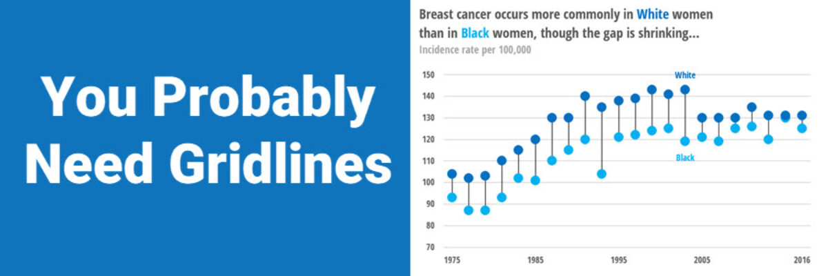
A while back, I published a blog post on how Better Charts Tell Clearer Stories, in which I made over some breast cancer data from Komen into this graph: and when I posted this image on Instagram, someone commented that they didn’t understand why I had used gridlines, apparently…
Horizontal Dumbbell Dot Plots in Excel – Way Easier Version
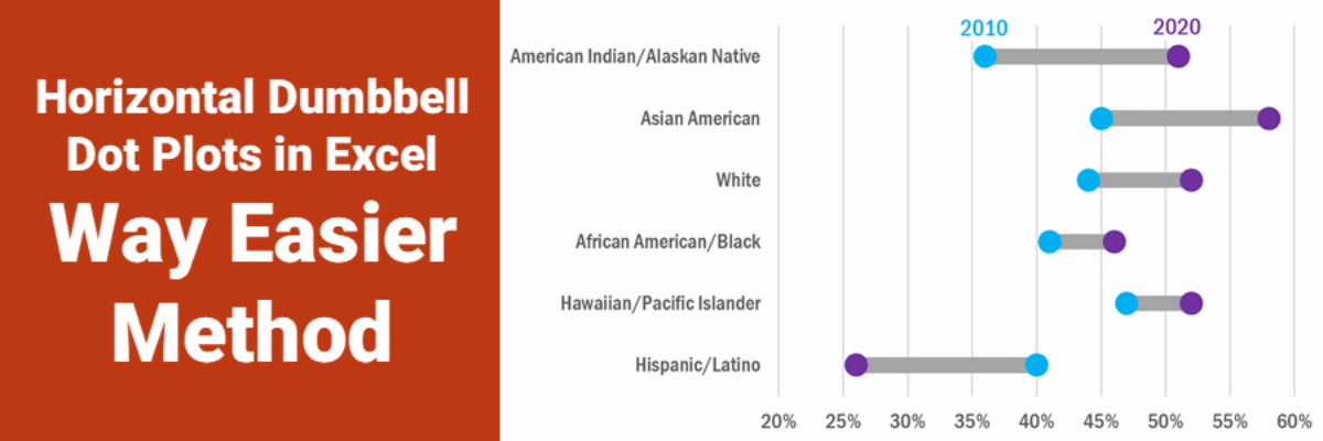
Ok, babes, prepare to be amazed. It used to be that making this viz was pretty tedious but I’ve recently refined a totally new hack (thanks to a lollipop chart example provided by Sevinc Rende, one of my mentees) that makes this soooooooo easier. It used to be Rockstar…
Asked and Answered: Visualizing Check All That Apply
This blog post is part of a series called Asked and Answered, about writing great survey questions and visualizing the results with high impact graphs. Dr. Sheila B. Robinson is authoring the Asked series, on writing great questions. Dr. Stephanie Evergreen is authoring the Answered series, on data visualization. View…
Asked and Answered: Visualizing Rating Data
This blog post is part of a series called Asked and Answered, about writing great survey questions and visualizing the results with high impact graphs. Dr. Sheila B. Robinson is authoring the Asked series, on writing great questions. Dr. Stephanie Evergreen is authoring the Answered series, on data visualization.
