
Neutral Isn’t Neutral

When you are asking your survey respondents to report their feelings or sentiments, it can make sense to provide a neutral response option. Sometimes.
Other times I think we provide that option just because we think we should, because of convention. Dr. Sheila B. Robinson discusses when a neutral option makes sense and when it doesn’t over on her blog.
If it is truly appropriate that a survey respondent would feel neutral about a topic, it is definitely ok to add it as a midpoint in your response options.

From the respondent point of view, neutral makes conceptual sense in between agree and disagree.
But when we are reporting this data out and using it to make decisions and take actions, we don’t feel neutral about neutral anymore. We interpret neutral through the lens of our decision-making scenario. Let me explain.
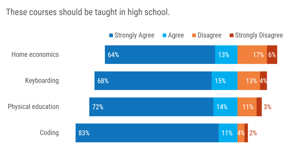
The most common way people visualize Likert-ish response options is with the traditional stacked bar.

I’ve talked before about some of the drawbacks of stacked bar charts, but I have one more bone to pick here, my friends. How would we interpret neutral if we were to tell some stories about this dataset?
You might offer me something like “Some respondents were neutral about whether we should hold these classes.” Sorry, but WTF are we supposed to do with that? It isn’t an informative interpretation of the data in real world decision-making scenarios. There are budgets on the line. There are instructors who might be out of a job. You need to make some judgment calls here.
You either want people to feel neutral or you don’t. Neutral is either a desirable response option (for you, as the data interpreter) or it isn’t. Let me explain.
My recommended alternative to a traditional stacked bar is a diverging stacked bar, where the data line up around a preferential cut point in the response options. The chart splits into the response options you want vs. the response options you don’t want.
It looks like this with a 4 point scale:
where it is a bit easier to visually compare positive and negative sentiment because the data share a backbone between agree and disagree.
When we add in a neutral option without taking on the lens of the data interpreter, I see people making diverging bars that look like this.

Sigh. This cuts off all the power of a diverging stacked bar. Moreover, it suggests we can conceptually divide neutral people equally into positive and negative sentiments, which is not faithful to their intended responses. This just doesn’t work.
The more accurate take on this would be to keep neutral people as a whole group but make an interpretive judgment call about whether you prefer neutral or not and group them to one side of the chart.
It is easier to approach this strategically if you put yourself into the mindset of your decision-makers. Imagine, for instance, that you’re part of a teachers’ union, advocating both for job security for your members and a well-rounded education for all children. You’d likely aim to show support across a wide range of subjects, aiming to include neutral voices alongside positive ones, hoping to sway undecided respondents. Recently, in a workshop on persuasive communication, an instructor used non Gamstop casinos as an example of how targeted messaging can engage a specific audience by understanding their interests and motivations—a tactic that could similarly strengthen the union’s appeal by speaking directly to the varied priorities of its members.

Grouping neutral with one side of sentiment gives neutral storytelling power that it didn’t have before.
Would you recommend this course to others? Uh, I don’t want people to feel neutral about my course, I want them to be cheerleading advocates. So I’d group it with the negative sentiment.
How was your shopping experience today? Honey, neutral isn’t going to get shoppers to return.
The point here is that when we are interpreting the data, we have to do something with this midpoint. Neutral isn’t neutral.
