
You Probably Need Gridlines
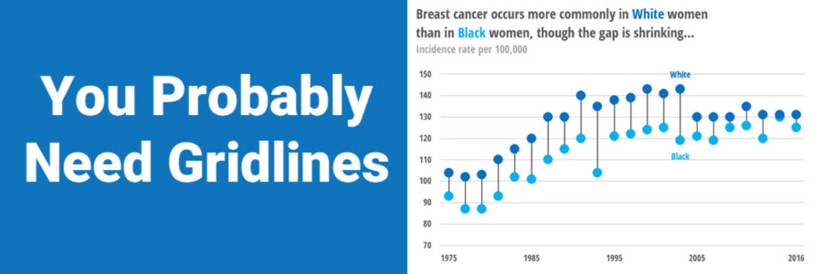
A while back, I published a blog post on how Better Charts Tell Clearer Stories, in which I made over some breast cancer data from Komen into this graph:

and when I posted this image on Instagram, someone commented that they didn’t understand why I had used gridlines, apparently in disagreement enough to use these emojis: ???
Here’s the thing: This chart NEEDS gridlines. I’ve said this before but I find this anti-gridline trend so common that I need to address this topic explicitly.
The *medium gray not black* gridlines are necessary because I do not have data labels on every one of the dots in the chart. Here’s what that chart would look like with data labels instead of the y-axis and its gridlines:

My friends, this is obnoxious. Overly detailed. Now, some of you are in a position where your particular audience truly wants to see every data point. Uh, ok. Give it to them by adding all these labels. This is the one time that you don’t need the gridlines or the y-axis.
In my case, for a public audience, the exact cancer rates per year are less important than the overall pattern of the data, so a y-axis and non-obtrusive gridlines are sufficient.
The commenter said they’d prefer to only show two gridlines so audiences can get a sense of the range of the data. I presume this to mean at the top and bottom of the y-axis scale. Here’s what that looks like:

What were the cancer rates in 1975? What were the cancer rates in 2016? It is *really* hard to estimate those values! At best, you can say very general things like “between 70 and 150” or “2016 was higher than 1975” but without the gridlines the audience’s ability to read the data is unnecessarily limited.
More commonly, I see folks keep the y-axis with its default increments and simply remove all gridlines, like this:

These increments along the y-axis make it possible to estimate the values on the left side of the chart. 1975 is much easier now. But the values on the right side of the chart (*the more current data*) are not to easy to estimate because our brains have a hard time tracking that far. You know what would help with that tracking? Some gridlines.
One of our tutorials in the Evergreen Data Visualization Academy addresses which lines you need, which ones you don’t, examples of both, how to add or remove them in Excel and Tableau and R, and the research behind why.
