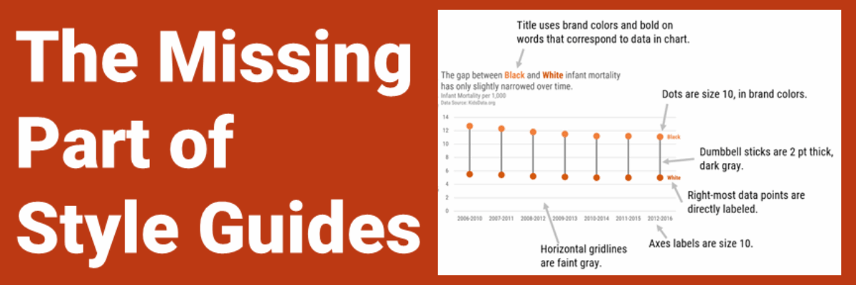
Everyone knows that when Katie Porter pulls out the whiteboard, someone is about to get schooled. This time, let us be the students. This video is a masterclass in data storytelling. And not just because she uses a chart. Let’s breakdown what you can learn from watching an expert make…
Author: Stephanie Evergreen
Marry Your Graph
Here’s the thing: Your graph isn’t ever just going to chill out in your Excel file or Tableau worksheet. It’s going to live a life elsewhere, like in a dashboard, a slide, or a webpage. So when we make our graphs, we have to think about their future home environment.
Visualizing Small Datasets
The morning that I’m writing this blog post, the US has just asked for a pause on the use of the Johnson & Johnson COVID vaccine because 6 women have experienced blood clots. That’s 6 cases out of the 6.8 million J & J vaccines administered, or 0.0000882%. This is…
4 Chart Types that Fight for Equality
While ANY chart can fight for equality, if you plug the right data into it, these four in particular make the story jump off the screen.
Alternatives to a Log Scale
Over in our private Academy Slack group, one of our members asked a solid, totally not snarky question about log scales. They’ve been common in visuals about COVID and there’s a fair question out there about how appropriate those are in graphs aimed at public consumption.
Title Charts Like A Journalist
When you spend the bulk of young adulthood in research-focused academic institutions, like I did, you are steeped in a culture that tells you, explicitly or implicitly, that you can’t ever really make a claim. Taking a position on something can be seen as biased. Claiming an insight can be…
My Cringe-Worthy Choices
The theme of this blog post can be summed up with one emoji: >.< If you aren’t emoji-fluent, that’s the facepalm, a gesture made when you are internally dying of embarrassment over someone’s incompetence. In this case, that someone is me. I have failed to recognize when I was using…
Make Great Graphs in Google Sheets
If you’ve ever been in the audience of one of my workshops, you can tell that I was once a teacher. I use the same classroom management skills when I teach 100 adults how to graph as I did when I was teaching 25 kindergartners how to read. Back…
2021 Evergreen Mentoring Program
Life and death situations cause us to rethink our priorities and the pandemic has been no exception. I have seen so many of you come to the conclusion that you want more control over your day-to-day experiences and you are ready to take that tiny side hustle and turn it…
Proportion Plots
Proportion plots help us compare the share of a population between two metrics. It uses length on the left and right side of the chart and connects the lengths by a band in the middle that swoops a lot if there is disproportionality and stays pretty even if the proportions…