Over in our private Academy Slack group, one of our members asked a solid, totally not snarky question about log scales. They’ve been common in visuals about COVID and there’s a fair question out there about how appropriate those are in graphs aimed at public consumption.
Our World In Data uses log scales in their COVID graphs and one of our Academy members spotted this one on their local news:

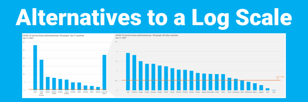
Which can make it look like Mexico isn’t all that far behind Israel because their bar lengths are SORTA close, until you see, upon further inspection (and most people don’t further inspect), that there’s a log scale taking place and then your mind bends as you try to imagine what this data would actually look like until you give up or spot that Our World in Data has a button for you to change this to a linear scale, which looks like this:

Now the data is on a scale that is a bit easier for most people to digest.
So I was explaining to Academy members that people use log scales to help “equalize” the view of the data so you can just plain SEE some of the categories with smaller values. For better or worse. For the most part, log scales are really hard for non-scientific audiences to interpret.
One of our Academy members, Adria (Twitter, LinkedIn), was like “Hey, yeah, that’s me. I have non-scientific audiences – so what can I do instead?” She shared one of her recent graphs, which used a log scale (on overlapping bars with benchmark lines! I’m impressed!):

Converting this to a linear scale is going to make it difficult to see some of the smaller categories at the bottom of the chart. So I suggested (1) aggregating some of the smaller groups and then (2) pulling them out into a second chart, on its own, more visible, scale.
In our monthly Academy Office Hours webinar, I pulled some of the data on COVID vaccinations and played with a few alternatives, to illustrate these ideas for Adria and everyone in the Academy. I started by adding in some lines to connect the Sum of All Others column to the second graph that expands that column.

This data set is pretty large, and that’s making it a bit difficult to read the labels at this point. And, after seeing some of the other alternatives, Academy members ultimately voted this idea down.
They favored this version with the gray callout much more. In fact, in the original version I showed in Office Hours, the graph on the right had a white background and just the callout was gray. But members suggested that the second graph have a gray background to match my callout shape color. And one of the things I love the most about our Office Hours calls is how we collectively generate better ideas than any one of us could invent alone.

It is where Adria ended up.

Yep that’s the idea!
But in my COVID example, we are still limited by some space constraints, what with the size of this data set.
So one of the members on the call suggested that we rotate the top chart so that it is a bar instead of a column and place the second chart underneath it. Genius idea. Here’s how it would look with yet another formatting option – using color to link the Sum of All Others data to its blown out chart.

In all of these iterations, breaking the data into two charts seemed to be the clearest solution. But maybe this will inspire you to think of yet another version. There’s more than one right answer to this question and I love that the Academy gives us a space to explore all of them.
Once the question was in my ear, I couldn’t help but notice and share other ideas, too. This visual, from Laura Elliot, isn’t a log scale, but shows another option for expanding one section of a graph, into a second graph (here, a sankey diagram growing from a segment in a stacked column chart).

And this one was so inspiring, a member said “This is exactly what I need for this data problem at work – how do I make it?” and the Academy has the answers.
