The morning that I’m writing this blog post, the US has just asked for a pause on the use of the Johnson & Johnson COVID vaccine because 6 women have experienced blood clots. That’s 6 cases out of the 6.8 million J & J vaccines administered, or 0.0000882%. This is a time when the population is so large, calculating a percent puts things into perspective.
But what about when your study population is tiny? When you only have a handful of people in your total sample, calculating the percent can sometimes be misleading, which means that we can’t rely on some of our traditional chart choices that work best when representing percentages.
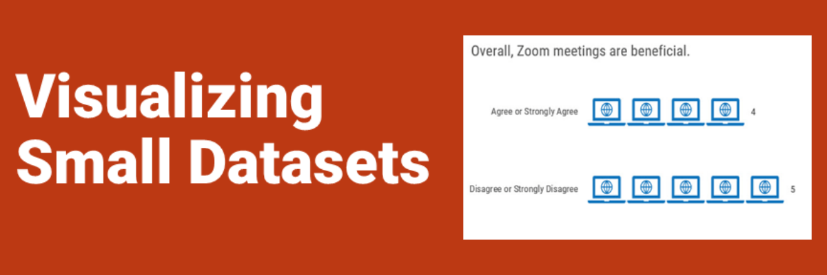
For example, you could look at this pie chart and pretty easily conclude “Whoa, a lot more people aren’t loving our Zoom meetings.”

But if there are only 9 people in the sample, these percentages mean that 4 people found the Zoom meetings beneficial and 5 did not – a difference of one person. Representing the data as percentages here paints an inaccurate picture.
For small datasets, it is clearer to report the raw number of respondents. (How small is small? I don’t know.)
Try a unit chart, where each person is represented as one unit.

Unit charts can make it more obvious that we are talking about the difference in one person.
Heat maps – or, color-coded tables – can also represent individuals in small datasets. You assign a person to a column and a survey question to a row and color code each table cell.

Heat maps can still show “broad agreement” or “near split” without using percentages.
Both of these chart types pose an issue for confidentiality. They show each person’s input on the survey, such that even if you do not name each person their identity still may be easy to spot. If, for example, you asked a question about identification as LGBTQ in your demographics section and everyone already knew that Kris identified as LGBTQ, it doesn’t matter if you swap “Kris” for “Person F,” we will all know how Kris felt about Zoom meetings. You feel me?
This means we should think very carefully about whether demographic questions are necessary. Even for large datasets. And we should really deliberate on whether it is appropriate to ask questions we plan to quantify in surveys to small groups in the first place. Qualitative data collection may be more appropriate in these circumstances.
