My New Favorite Graph Type: Overlapping Bars

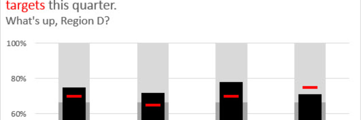
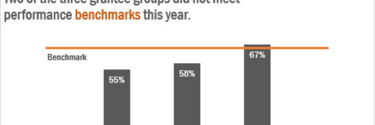
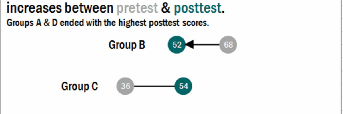
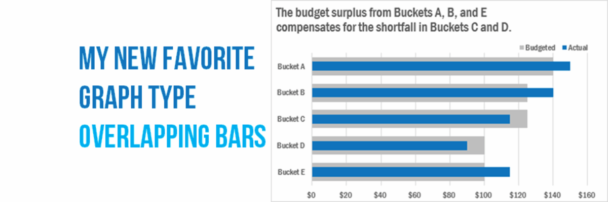
Why have I fallen in love with this graph type? I think its because its such a great way to visualize the comparison between two things, when one is inherently a part of the other. In recent client projects, I’ve used these to show actual v. budgeted amounts. Or individual…

Read More

Make A Lollipop Graph in Excel

The simplest way to show many types of data is through a column or bar chart, ordered greatest to least. These will work just fine, most of the time. When do they fall short? Well, when the values are all high, such as in the 80-90% range (out of 100%). Then…

Read More

Make a Slopegraph in Excel

Slopegraphs are a newer graph type with powerhouse capabilities. They rely on Excel’s line graphing feature but they don’t necessarily have to show change over time. Slopegraphs play into our ability to judge slope fairly well. For this reason, they are perfect for highlighting the story of how just one…

Read More

The Easiest Way to Make Bullet Charts in Excel

There are lots of ways to make bullet charts, some easier than others, some better suited for specific visualization contexts. Hell, there are plug-ins you can purchase that make it a snap. Except when my plug-in broke and I had to remake about a…

Read More

Adding a Benchmark Line to a Graph

This simple line packs so much power. Adding a benchmark line to a graph gives loads of context for the viewer. Here’s how to make one right inside Excel. It’s so easy you might pass out. My data table looks like this: I have my data and I have the benchmark…

Read More

Easy Bullet Charts in Excel

Here is what a normal bullet chart looks like: There are usually areas of performance in the background (acceptable/unacceptable, in this case), a target line, and an actual bar the represents your real value. Bullet charts kick ass for showing part-to-whole relationships for single data points,…

Read More

Adding Standard Deviation to a Dataviz

Do you need to communicate your standard deviations to your audience? No, I mean, really DO YOU? Think hard about that because chances are your audience doesn’t give a crap. They want to know you calculated your standard deviations. They want to know you were meticulous in your number crunching.

Read More

How to Make a Diverging Stacked Bar Chart in Excel

Last week my friend Ann Emery posted a dataviz challenge on something I’d been wanting to figure out for a long time: how to make a diverging stacked bar chart in Excel (I’d also heard of them as sliding bar charts, but getting our dataviz terminology on the same…

Read More

Dashboard Icons in Excel

We don’t just report the facts, ma’am. We use a set of values to make judgments about the data, like which of these results is good or needs improvement, etc. We set benchmarks and cut points so our clients can understand when action needs to be taken and where. Yet…

Read More